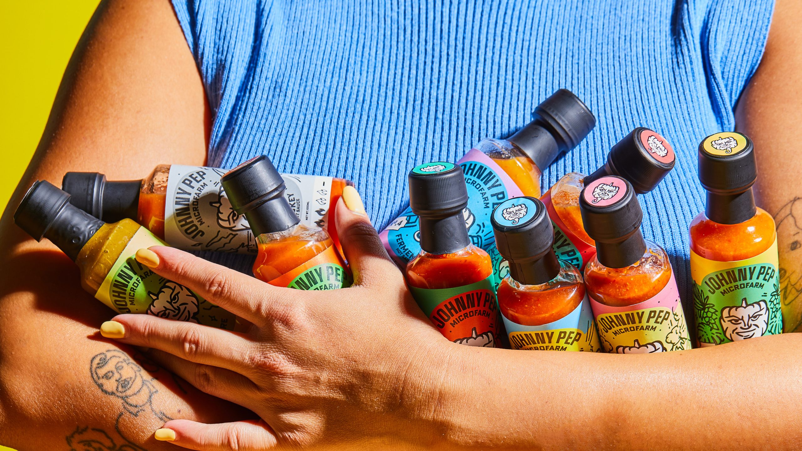
The packaging design for Johnny Pep Microfarm hot sauces is playful, with energetic color palettes that make each bottle stand out. Quirky illustrations, like the smiling pepper mascot, add a sense of warmth to the brand.
The hand-drawn typography and vintage-inspired design details give the labels a personal, crafted feel while maintaining a clear focus. Each variant’s color combination reflects its flavor profile, creating a cohesive yet dynamic lineup that invites exploration.