Adding A Sunny Disposition To A Market That’s Otherwise Stagnant
By
Published
Filed under

By
Published
Filed under
Wonderkind Co’s packaging design for The Morning Juice Co is a refreshing departure from the ordinary OJ offerings. With its cheerful illustrations and lively typography, the packaging exudes a captivating sense of nostalgia. The incorporation of vibrant yellows and oranges in the photography celebrates the essence of sunshine and orange juice and infuses the packaging with an undeniable burst of energy. The clever use of blue as a pop of color within the packaging system allows the typography on the box to come alive, ensuring that The Morning Juice Co stands out as a vibrant and innovative choice within a stale market.
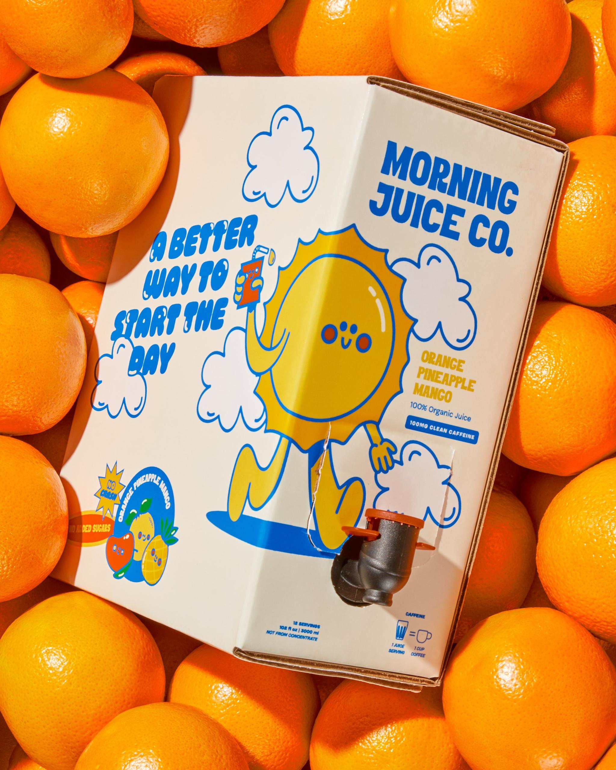
Our mission was to create packaging that could really shake up the sleepy OJ shelf and give a new sense of innovation to a seemingly stale competitive set. Its cheery illustrations, bubbly typography, and a comic book storyboard deliver a sense of nostalgia and will be sure to brighten up your morning (and your everyday breakfast routine). We incorporated bright yellows and oranges in the photography to highlight both the sunshine + the orange juice, along with a shade of blue to make the typography on the box ?POP?!
Get unlimited access to latest industry news, 27,000+ articles and case studies.
Have an account? Sign in