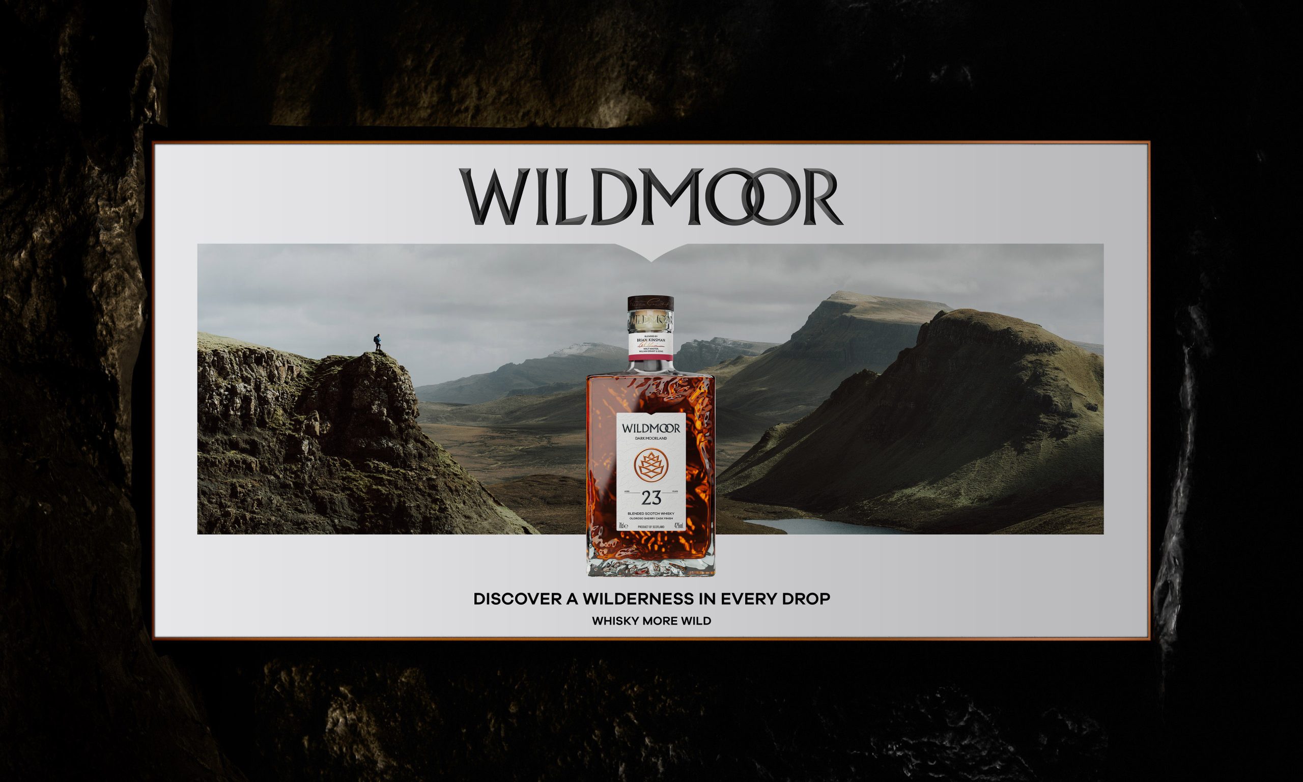
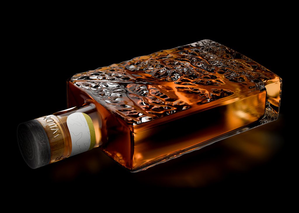
The Mancunian agency LOVE created a real work of art in their bottle design for the scotch brand Wildmoor, a perfect blend of traditional craft and modern techniques. The bottles come in a classically rugged rectangular shape with white labels with no-nonsense sans serif, lined with alluring metallic details on the cork, paper, and a shiny coin around the neck. But the coolest part is a more unexpected turn: a ripply, mountainous glass texture that brings the wild, mountainous topography of Scotland to life when turned face down.
Manchester-based creative agency LOVE presents Wildmoor, a new range of luxury blended Scotch whiskies from William Grant & Sons (WG&S). The type of project that every creative agency dreams of, Wildmoor saw LOVE work closely with WG&S to identify what the luxury whisky category was missing and build a whole new brand proposition around it: a more modern imagining of how Scotch is perceived and what it stands for.


