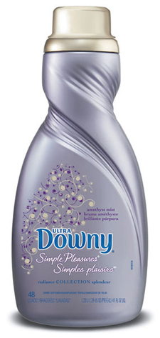
I was walking through my local grocery store the other day, and was struck by this packaging for Downy Simple Pleasures’ new Radiance line. I just had to pick it up. The structure obviously alludes to the product usage, but it is done in an appealing way with a strong shelf impact. The color palette, and slight metallic finish, are equally appealing to the eye, in an aisle that is usually awash with bright, bold colors and messages. The structure does most of the work here, allowing the graphics to be more subtle and understated.