Superfantastico’s packaging design for Three Olives embodies the essence of an easygoing lifestyle. The bold, hand-drawn logo and energetic graphics successfully juxtapose the brand’s clean recipe, resonating with the target audience’s desire to break free from traditional norms. The packaging captures the essence of chaos and clarity, a vibrant manifestation of the Gen Z spirit. Each of the 13 flavors boasts a distinctive illustration style and color palette while maintaining a consistent visual identity, allowing Three Olives to look and feel distinguishable.
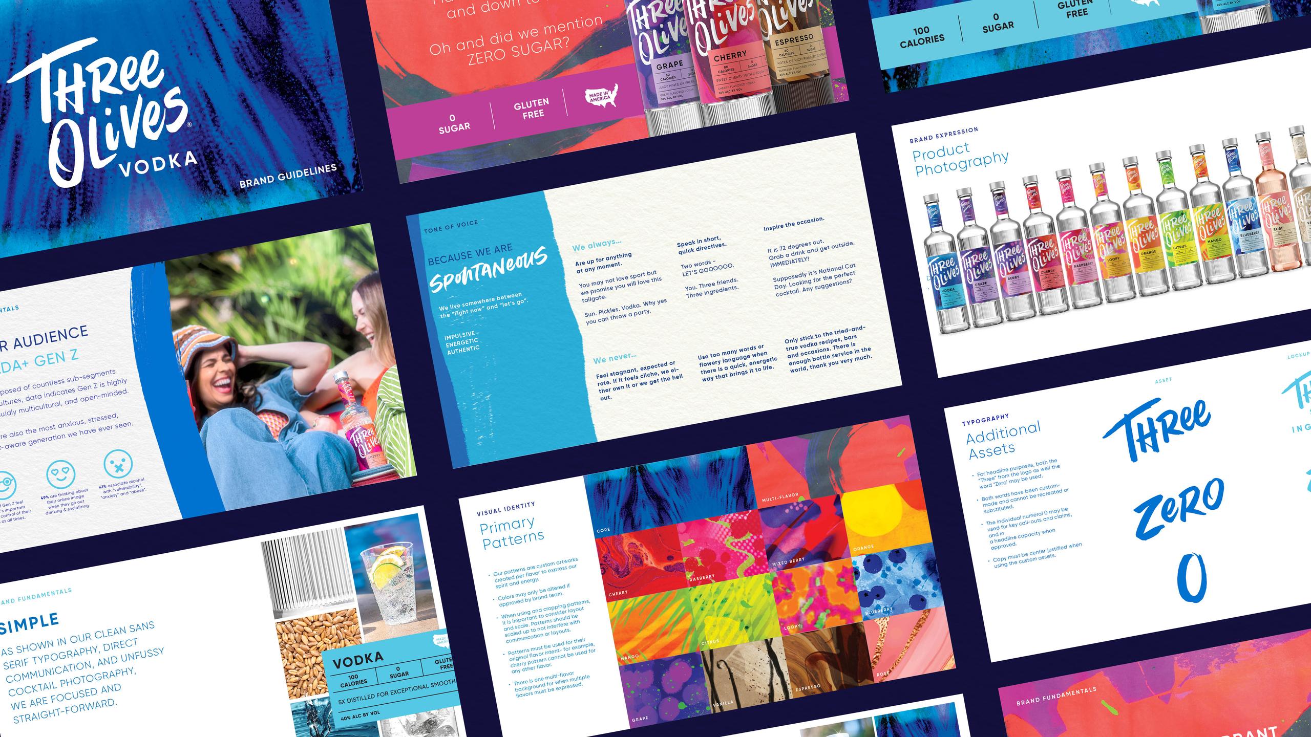
The Ask from Proximo Spirits: Revolutionize an existing vodka brand for a new Gen Z target that is pressed and stressed. They want a break from structure and rules; a vibrant, easygoing vibe that allows them to be who they want, when they want. They also want their vodka clean and pure, free from sugar and artificial flavors so Three Olives not only wanted to look and sound different, but also tout a new formulation. Our Solve: After honing in on a new brand positioning and consumer target, Superfantastico brought the brand and packaging to life by juxtaposing the simple new formulations with bright, energetic graphics. Our Gen Z target loved the chaos and clean – all on one label. We started with a new hand drawn logo, then updated everything to create an expressive, but easy to understand system. Each of the 13 flavors has its own unique illustration style and color palette while maintaining a consistent look and feel.