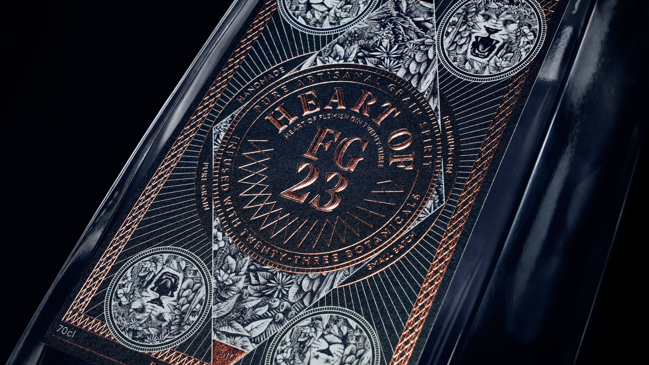
Flemish Gin 23 is distilled by Distillery De Moor, one of the last hot distilleries in Belgium. This means that it’s created in-house. The packaging reflects the traditional craftsmanship and pays homage to the distillery’s history and the flavors within the bottle. The two-faced botanical lion is used because the lion is the regional symbol from where the gin’s origin. The bottle’s label is intricate with fine details and mysterious with its ominous color palette but still remarkably approachable. The use of simple black and white mixed with a foil is all the label needs as far as color. It’s simply stunning.

Distillery De Moor is a family business guaranteeing passion and craftsmanship since 1910. The production is rooted in years of experience. The traditional products that they produce from way back have a permanent place in their range, and are still manufactured according to the recipe of yesteryear.