THIS IS IT! DIELINE Awards 2026 Late Entry Deadline Ends Feb 28
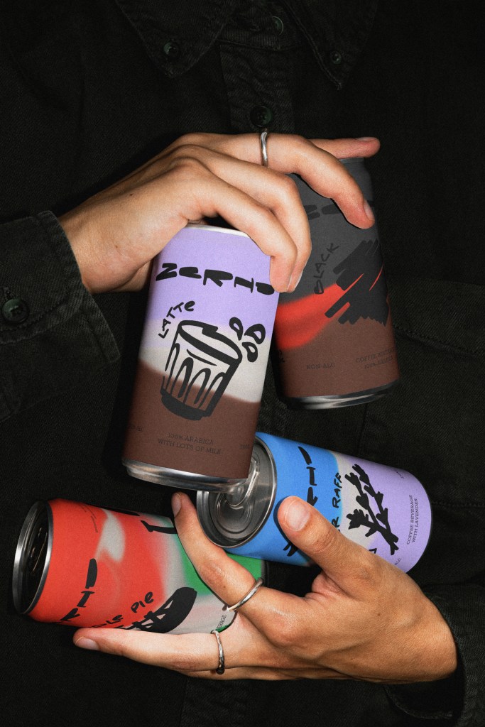
Zerno’s Packaging Balances Raw Typography and Confident Color
By
Published
Filed under

By
Published
Filed under

Zerno’s packaging, designed by otten agency, feels perfectly balanced between playful doodle art and your typical grocery aisle canned beverage. Each can highlights hand-drawn type, smudged color gradients, and oversized illustrations that lean deliberately unrefined. The typography is experimental, messy in the best way, and consistently off-grid. Despite the chaos, the system is tight with bold type, visual punch, and no-frills labeling.

Get unlimited access to latest industry news, 27,000+ articles and case studies.
Have an account? Sign in