Yumbo’s Fun-Loving Packaging Wants To Appeal To a New Generation of Soda Drinkers
By
Published
Filed under

By
Published
Filed under
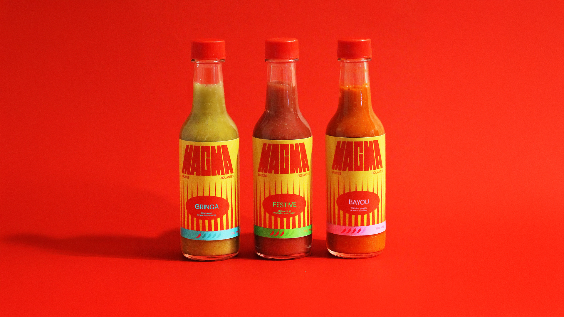
Yumbo’s packaging, designed by their internal designer Sam Chirnside, reflects a modern yet elegant take on soda branding. The bold, retro-inspired typography combines fluid curves with simplicity, creating an immediately recognizable wordmark.
Bright primary colors, like electric blue and orange, paired with minimal yet impactful illustrations of citrus fruits, echo the nostalgic charm of classic soda cans while feeling fresh and inviting.
Originally crafted by founder Ben Frazer and Swiss designer Kevin Hoegger, the brand identity celebrates Yumbo’s fun-loving spirit while making sure it resonates with a new era of soda drinkers.
Get unlimited access to latest industry news, 27,000+ articles and case studies.
Have an account? Sign in