THIS IS IT! DIELINE Awards 2026 Late Entry Deadline Ends Feb 28

“Hav” in Norweigian translates to “sea.” The glass’s soft blue tones and wave-inspired texture create a beautiful ocean-inspired aesthetic for Hav’s Gin packaging. Designed by Vbiasi Design, the smooth flavors of the gin are apparent through the polished packaging. Truly tranquil, the attention to detail within this bottle is unrivaled.
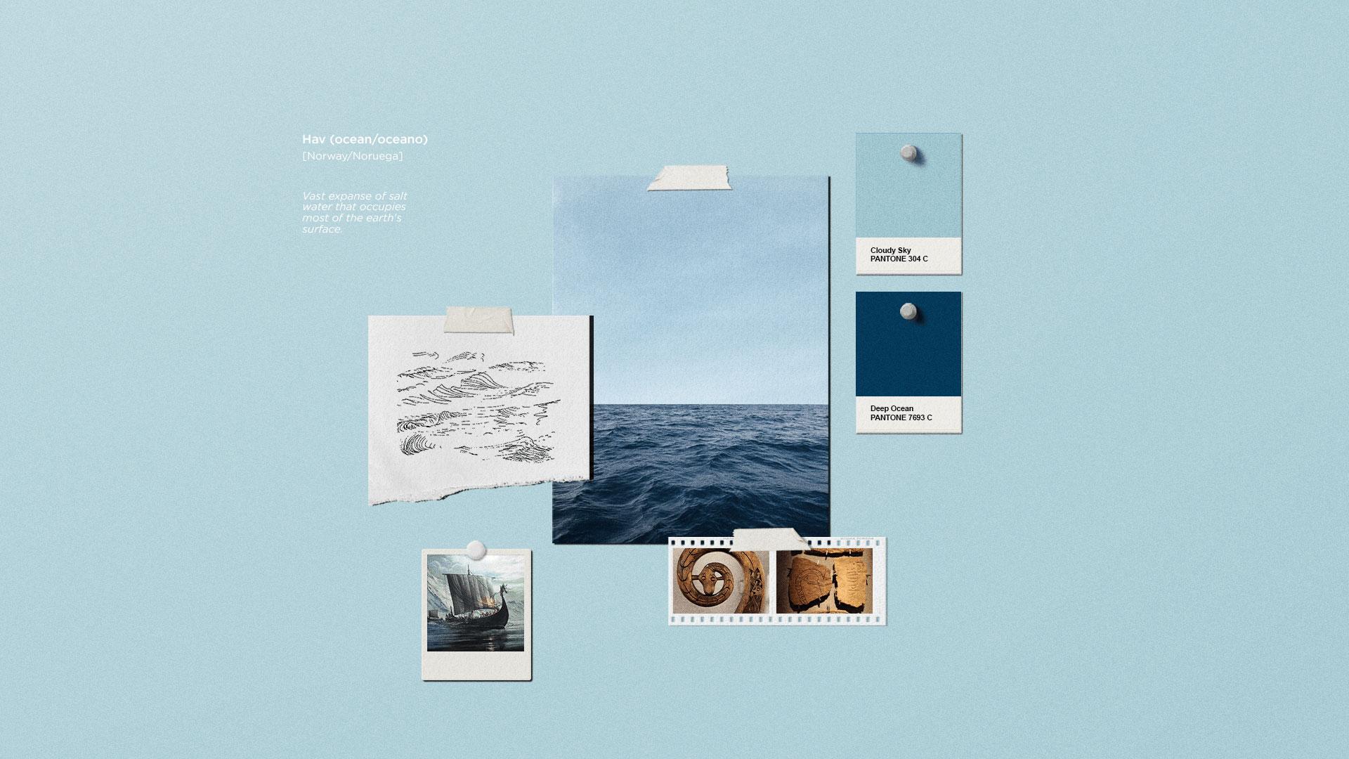
HAV, Norwegian translation for sea/ocean. This was the name chosen for this clean and smooth-tasting gin, created to please demanding palates and lovers of the classic London Dry style. We created a brand that strengthens and prioritizes the product name, with the letters HAV in a robust and striking typography, accompanied by a symbol inspired by Scandinavian ships, the region where the name and concept of the product were inspired.
Get unlimited access to latest industry news, 27,000+ articles and case studies.
Have an account? Sign in


