Yepoda Korean Skincare Rebranding Focuses On Clean And Accessible Beauty
By
Published
Filed under
By
Published
Filed under
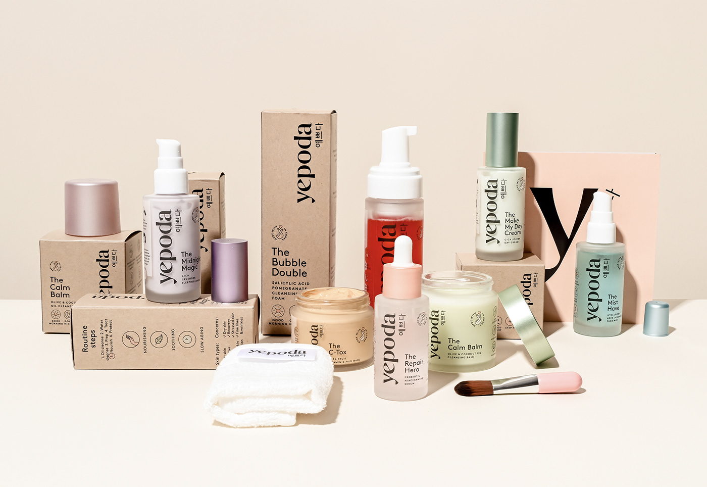
Kepoda’s skincare packaging, designed by OWLSOME STUDIO, introduces consumers to the ingredients inspired by accessible skincare. The packaging is simple, focusing on a clean and sophisticated design, highlighting a vertical logo that brings the user’s eye from top to bottom. Additionally, the color palette across the line is refreshing yet playful.


Get unlimited access to latest industry news, 27,000+ articles and case studies.
Have an account? Sign in