THIS IS IT! DIELINE Awards 2026 Late Entry Deadline Ends Feb 28
Xocoyo Packaging Puts A Modern Spin On History
By
Published
Filed under
By
Published
Filed under
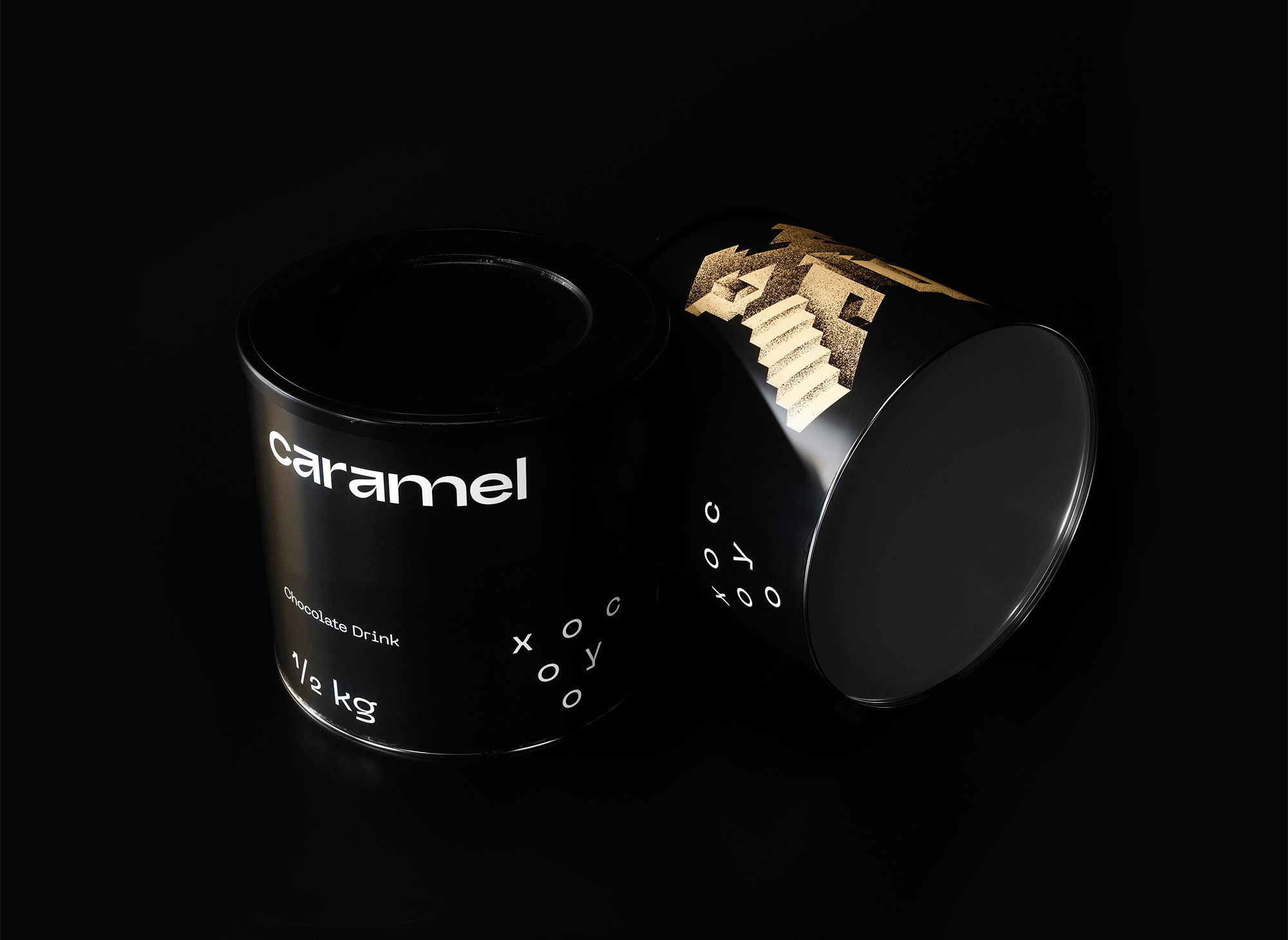
Move over Ovaltine, there is a new chocolate drink in town and it looks sleek. The conceptual packaging design for Xocoyo takes cues from Aztec history, but puts a minimalist and modern spin on them. The surreal and geometric elements of the package work together to make this chocolate drink look adult and instantly inviting.
Moctezuma Xocoyotzin II was a man who admired chocolate drinks. The last Aztec emperor was consuming a huge amount of liquid chocolate on a daily basis, and he cherished it so that he was describing it as a drink with godlike quality, building stamina and fighting fatigue away.
That story of the 13th century Mexican valley led us to create the name and the visual identity for the chocolate drink, Xocoyo. The obvious geometry of the logotype is a reference to the triangular forms that are common around that era across South America. The packaging revolves around the grandiose character X – the first letter of the brand’s name – while drawing inspiration from the brutalist architecture, which constituted the trademark of the Aztecan culture.
Get unlimited access to latest industry news, 27,000+ articles and case studies.
Have an account? Sign in


