Wein Goutte Gets a Label Glow-Up That Pops the Cork
By
Published
Filed under
By
Published
Filed under
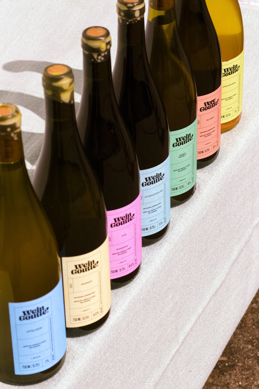
Simon Roy’s update for Wein Goutte leans into a stripped-back system.
The labels are oversized color blocks, and the tiny oval stickers are barely there. The tight typography, small icons, and short phrases create a contrast between the large fields of color. Across the range, the consistency of layout paired with shifting palettes keeps the collection orderly without flattening its character. This is minimalism.
Get unlimited access to latest industry news, 27,000+ articles and case studies.
Have an account? Sign in