THIS IS IT! DIELINE Awards 2026 Late Entry Deadline Ends Feb 28
Unveiling Harmony With Notonsunday’s Distinctive Packaging Design for Unspun CBD
By
Published
Filed under
By
Published
Filed under
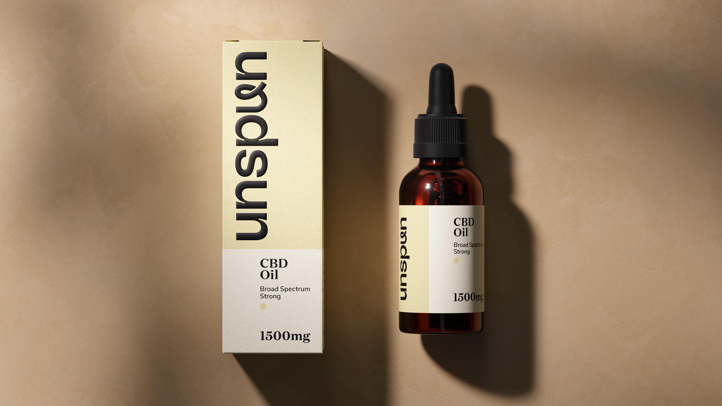
NotOnSunday’s packaging design for Unspun, a Premium CBD brand, reflects a blend of honesty and playfulness. Tasked with bringing the brand’s name, visual identity, and packaging to life, the agency collaborated closely with the founders. The distinctive ‘u’ in the Unspun brand, created as a play on the name, serves as an ownable asset that effortlessly integrates into the brand logotype. The result is a packaging design that not only captures the essence of relaxation and well-being but also establishes a flexible brand system, allowing for easy adaptation and expansion as Unspun continues to grow its product offerings.
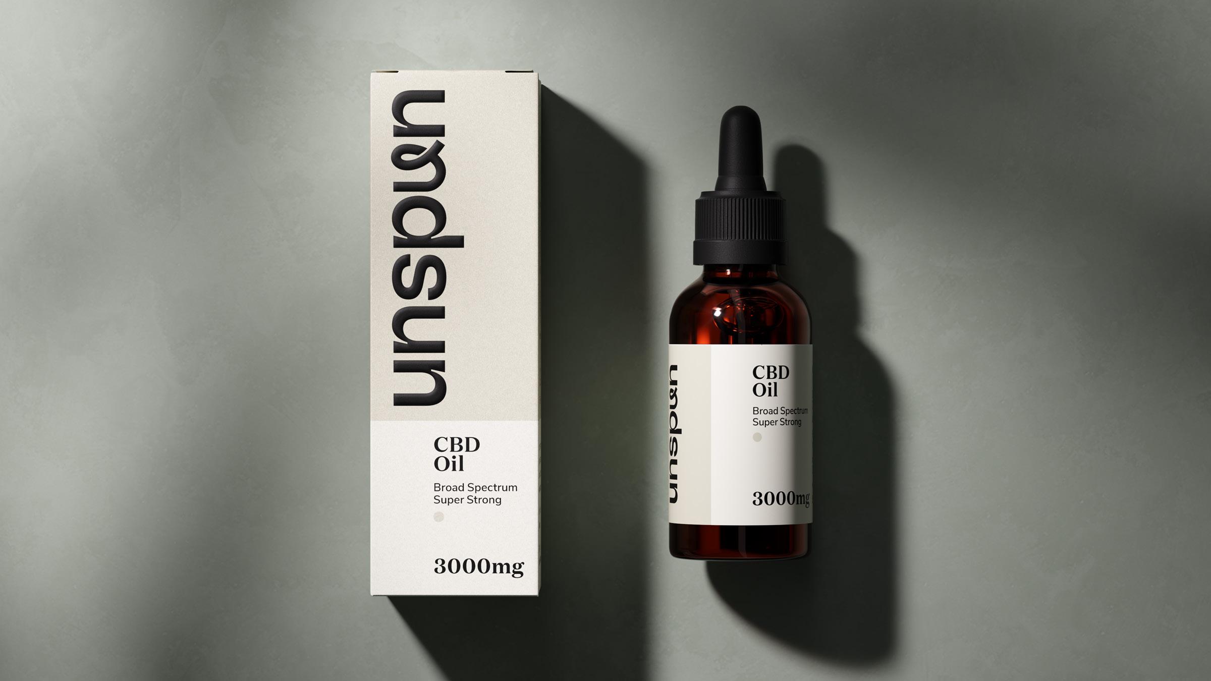
It’s time to relax with unspun Unspun is a Premium CBD brand. The idea and products were created by husband and wife team Joe and Gemma Wilde through their own experience of using CBD while living in California. It gave them a sense of calm and focus as they balanced the demands of work and family life. Back in the UK, they were delighted to see CBD entering the mainstream, but struggled to find a brand they felt they could trust. This is where the unspun brand was born.
Get unlimited access to latest industry news, 27,000+ articles and case studies.
Have an account? Sign in