Take A Byte Out Of This Gorgeously Designed Teeth Straightening Kit
By
Published
Filed under

By
Published
Filed under
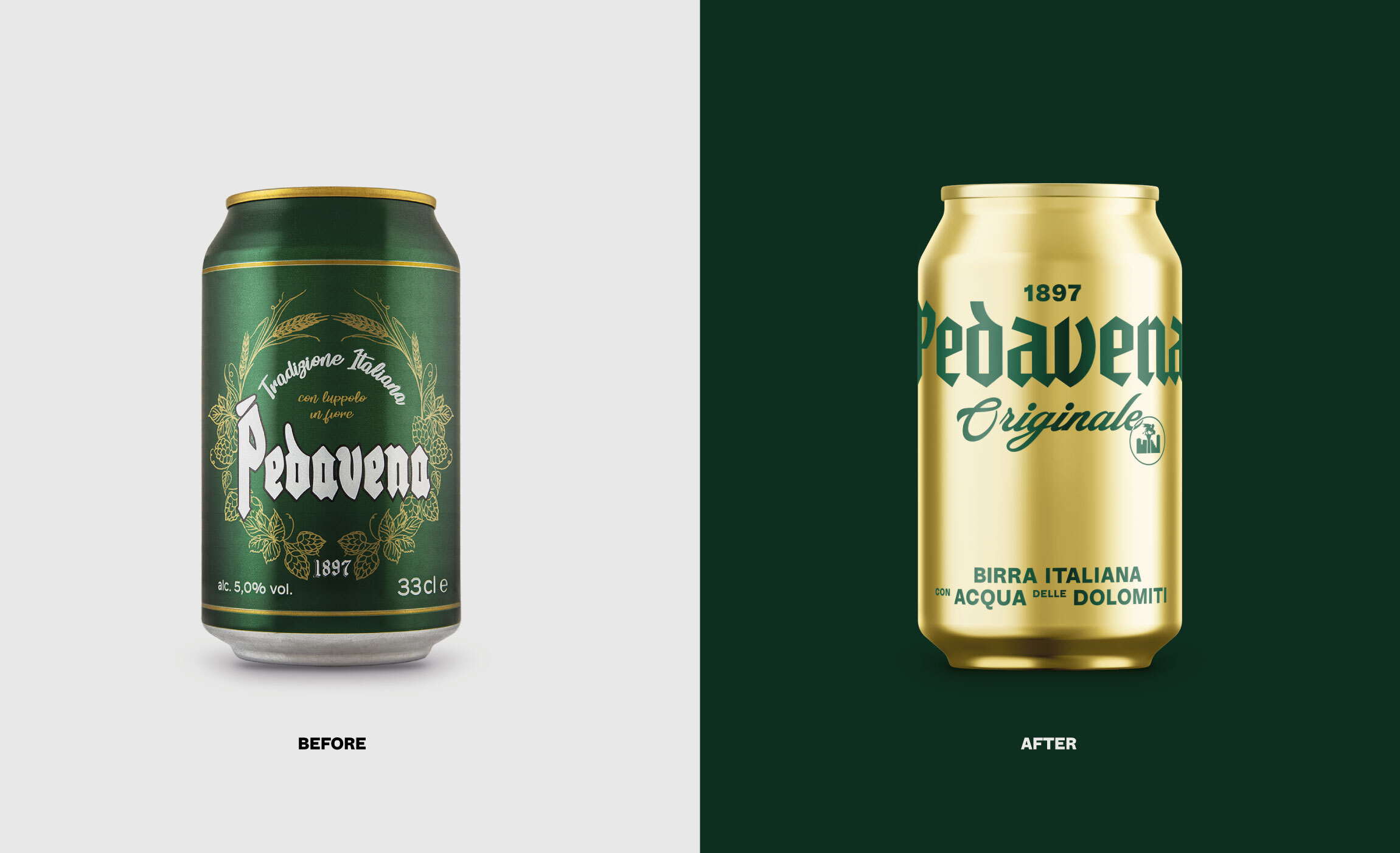
With a mission to bring more confident smiles into the world, the design for Byte packs a punch. Utilizing a striking cherry red and brilliant white, these two colors work together to make a brand design that is trustworthy and memorable. These personal aligners take the idea of embarrassing braces and flips it on it’s head, making this brand trendy and alluring. The san serif typeface used throughout the design is modern and full of millenial personality, making this the perfect alternative for people in their mid-twenties who would like a brush-up on their teeth, post high-school braces.
Our favorite design element is the chomp bite out of the b in byte, a subtle nod to the mission of the brand showcased in a fun visual way.
With hip copy throughout the brand identity such as “byte me,” this is a cleanly designed brand that looks sophisticated enough to capture the attention of an older crowd, with the spirit set to attract a younger one.
Get unlimited access to latest industry news, 27,000+ articles and case studies.
Have an account? Sign in