Student Week: Enhancing Sleep With A Whimsical Twist
By
Published
Filed under
By
Published
Filed under
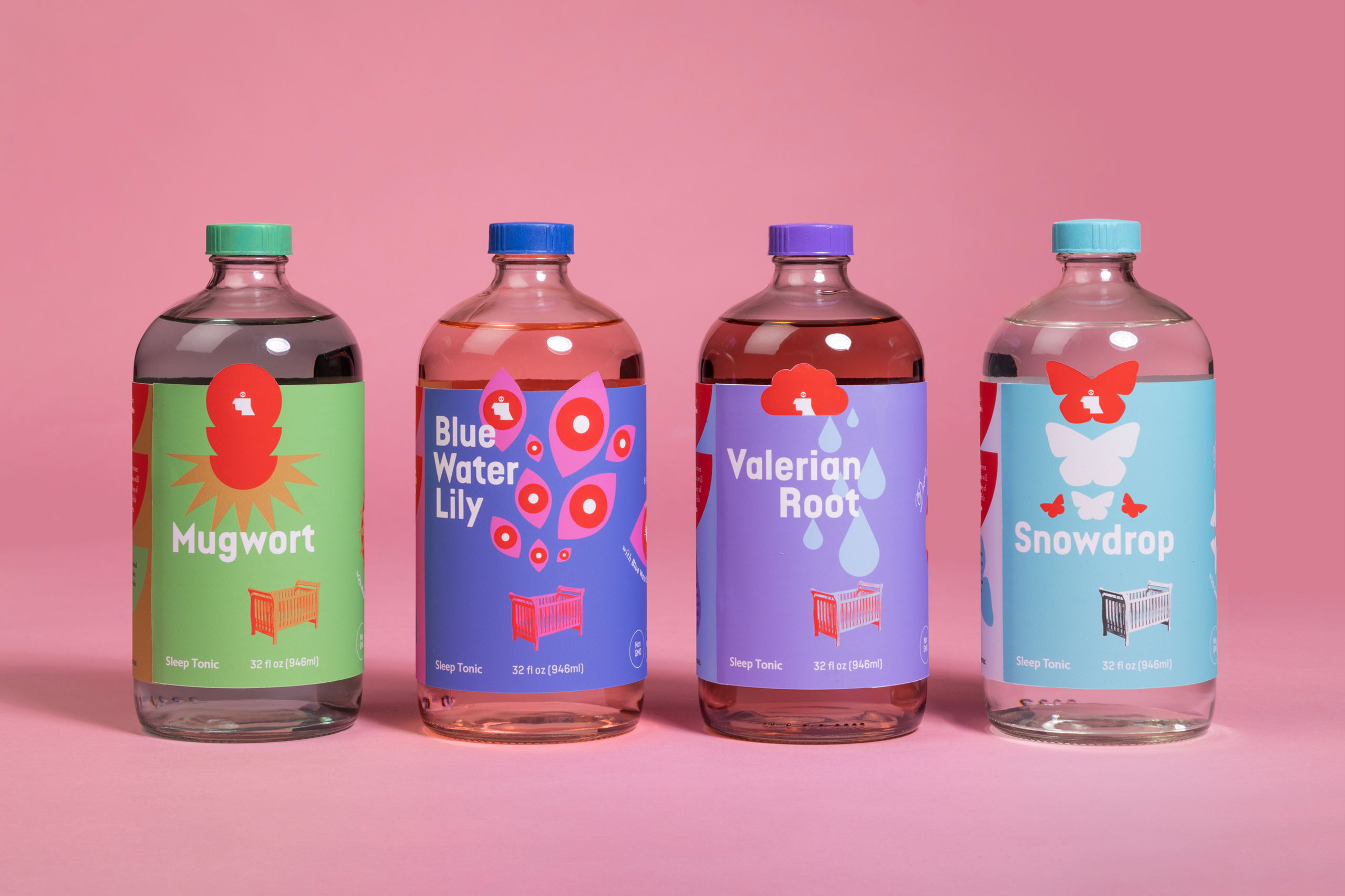
Aarushi Menon brings a striking vision to life with the packaging design for Dreamlike, an imaginative non-alcoholic beverage brand specializing in sleep tonics. Channeling the concept of “sleeping like a baby” with an added intrigue, Menon’s labels and point-of-purchase display capture the essence of restful slumber with a playful twist. By incorporating oneirogen into each tonic, the labels exude a sense of wonder and promise, inviting consumers to experience enhanced sleep and heightened dream vividness. The visual narrative of a child’s cot enveloped in intricate, dreamlike illustrations connects each tonic’s unique oneirogen to the fantastical world of dreams.

Dreamlike is a hypothetical beverage brand that creates non-alcoholic drinks. I designed labels and a point-of-purchase display for the brand’s line of sleep tonics. The design concept centers around the idea of “sleeping like a baby”, but with a little something extra. The intention of this branding was to make the prospect of restful sleep feel fun and enticing; each beverage contains a different oneirogen (a dream-altering substance) that promotes deep sleep while boosting dream vividness. I represented this concept through imagery of a child’s cot surrounded by graphic, esoteric illustrations that link back to the type of dream associated with the tonic’s featured oneirogen. The point-of-purchase display brings the visual language of the child’s cot and floating icons into a three-dimensional space. I assembled the structure with laser-cut plywood, vinyl stickers, and paint.
Get unlimited access to latest industry news, 27,000+ articles and case studies.
Have an account? Sign in


