Even adults love interactive design.
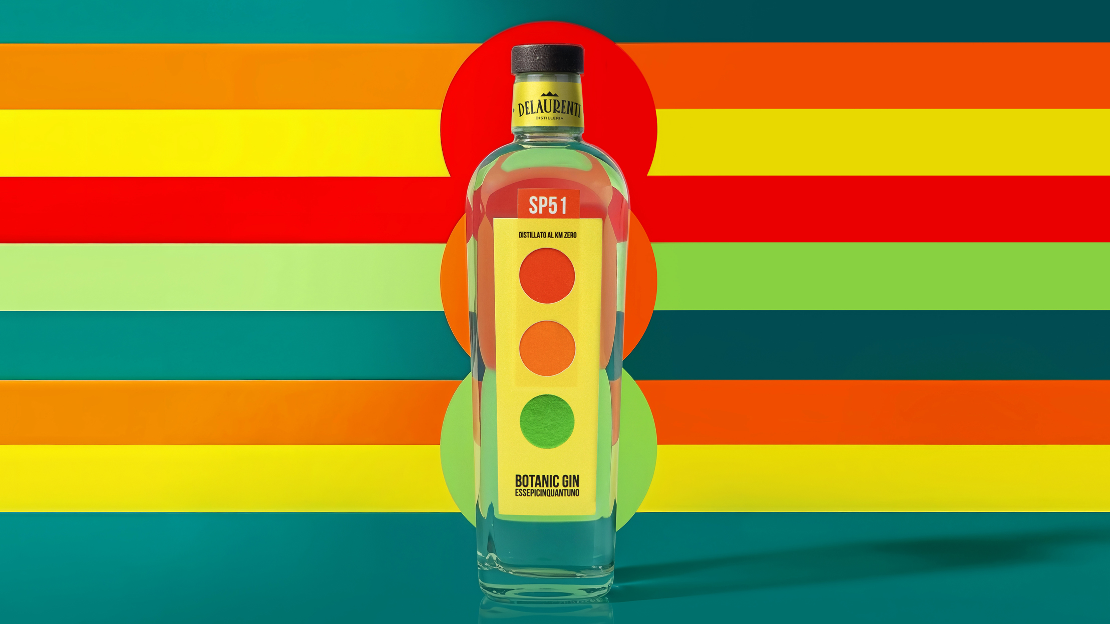
SP51’s packaging by Killeridea borrows from traffic signage and industrial logic rather than spirits tradition. The vertical label reads like a signal panel, with stacked circles referencing traffic lights. The typography is compressed, prioritizing clarity over flourish. Yellow, red, and green push urgency and precision, nodding to urban systems and Italian graphic modernism. The pull tab transforms the bottle into an interactive object, rare in the spirits market.