THIS IS IT! DIELINE Awards 2026 Late Entry Deadline Ends Feb 28
Sophie Tyrrell’s Another Seltzer Is A Neon Rebellion in Conceptual Packaging
By
Published
Filed under
By
Published
Filed under
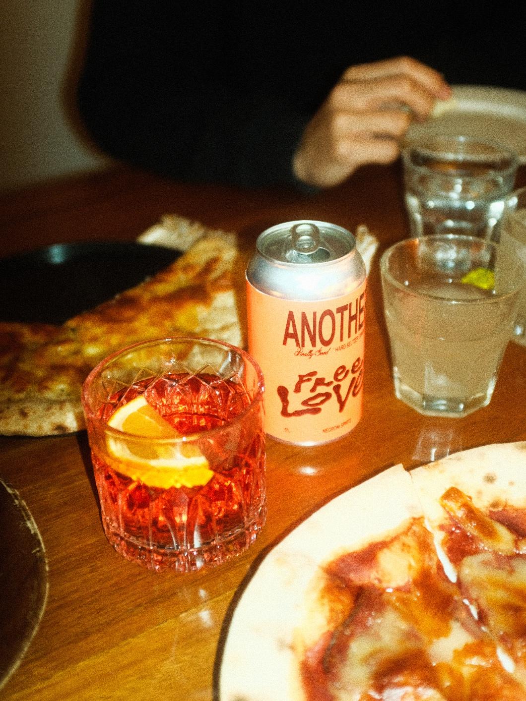
Sophie Tyrrell’s conceptual packaging for Another Seltzer is a rebellious homage to the print era, drawing inspiration from grungey, low-budget art, and music flyposters. The neon label colors pop vibrantly, creating a bold and unconventional visual impact that stands out in an era of digital perfection. The stunning use of gritty typography further enhances the brand’s countercultural influence, evoking the rebellious spirit of subcultural movements like punk and rave scenes. Another Seltzer becomes an irreverent love letter to the unconventional, rejecting refined aesthetics and embracing its design’s raw, imperfect, and rebellious nature.

Another Seltzer is an homage to the era of print and imperfection, designed with strong influence from grungey, low budget art and music flyposters, and the rebellious nature of subcultural movements like the punk and rave scene, the brand aims to make noise in an era of digital perfection. It is a love letter to Arial, and a rebellion against ‘refined’, saturated in countercultural influence.
Get unlimited access to latest industry news, 27,000+ articles and case studies.
Have an account? Sign in