THIS IS IT! DIELINE Awards 2026 Late Entry Deadline Ends Feb 28
Sol’s Redesign Let’s the Sunshine In
By
Published
Filed under

By
Published
Filed under

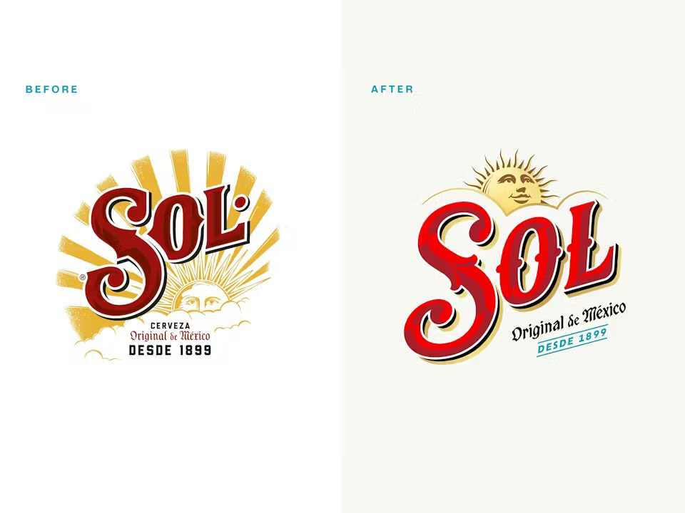
LOVE’s refresh for Sol keeps the brand’s sun-soaked attitude intact while just sharpening every visual cue. The wordmark has a new draw with punchier proportions, allowing the red-and-gold palette to work harder across cans, bottles, and multipacks.
Radiating linework around the sun icon delivers instant shelf pickup, and the metallic finishes on cans amplify the light-play central to the brand’s identity. The new design system feels tightly engineered for consistency, impact, and high-energy merchandising across formats. It’s a redesign done right, keeping the core of the brand alive while pushing it forward to modernize without losing its soul.
Steve Pearce, managing director at LOVE, shares more about the design process below.
Get unlimited access to latest industry news, 27,000+ articles and case studies.
Have an account? Sign in