THIS IS IT! DIELINE Awards 2026 Late Entry Deadline Ends Feb 28

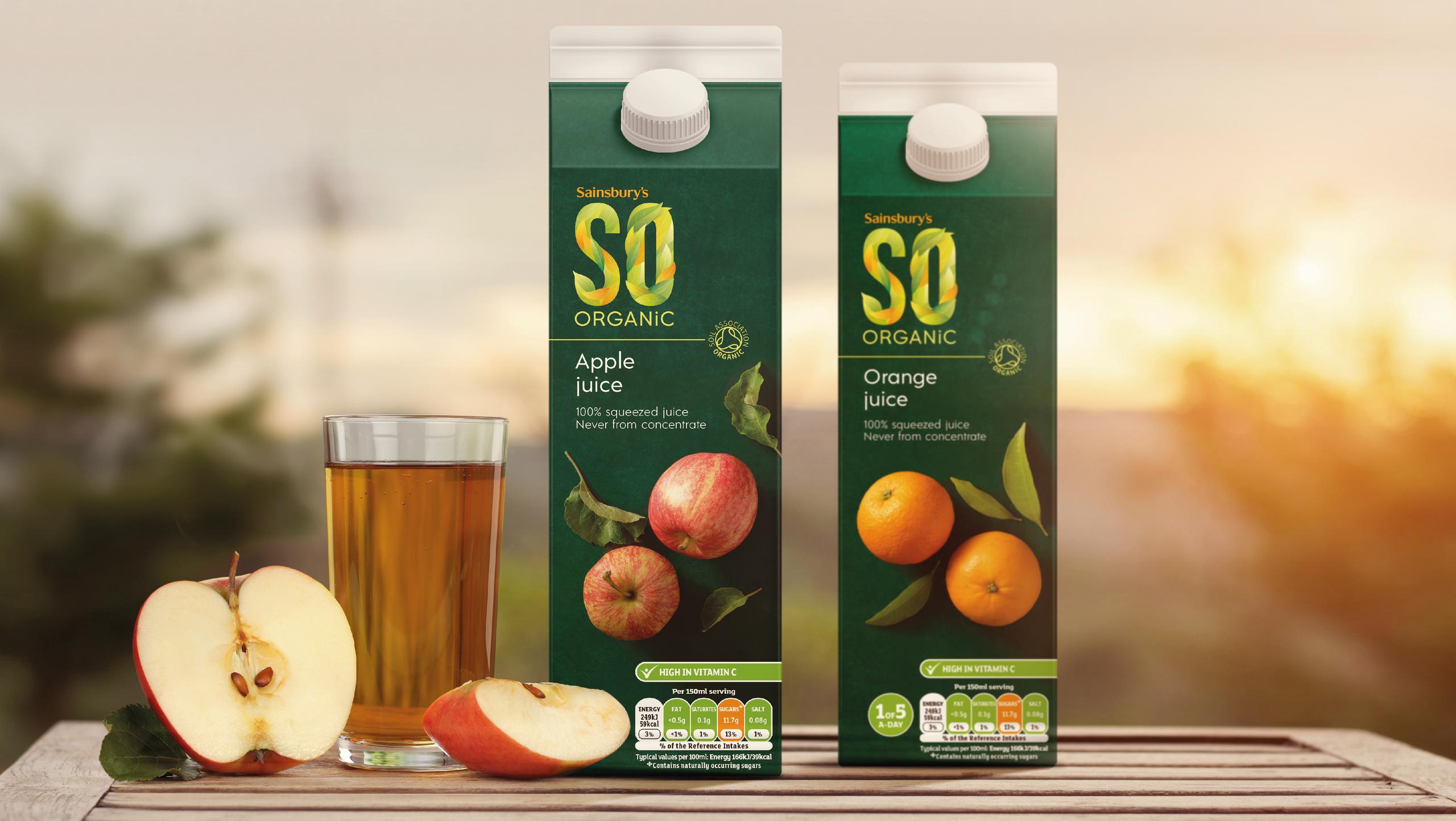
The brand redesign for So Organic, a new line of organic and pre-packaged foods, juices, jams, grains, and oils, invokes a feeling of harmony and trust.
Utilizing a rich green to represent nature, along with crisp photography, So Organic establishes itself as a hip and alluring brand without coming across as cold. The redesign makes quality front and center, instilling a feeling of confidence that guarantees they’re choosing a healthier diet for their family.
Get unlimited access to latest industry news, 27,000+ articles and case studies.
Have an account? Sign in


