THIS IS IT! DIELINE Awards 2026 Late Entry Deadline Ends Feb 28
Santa Eulalia’s Clever Logo Tucks a Little House Into Their Monogram
By
Published
Filed under
By
Published
Filed under
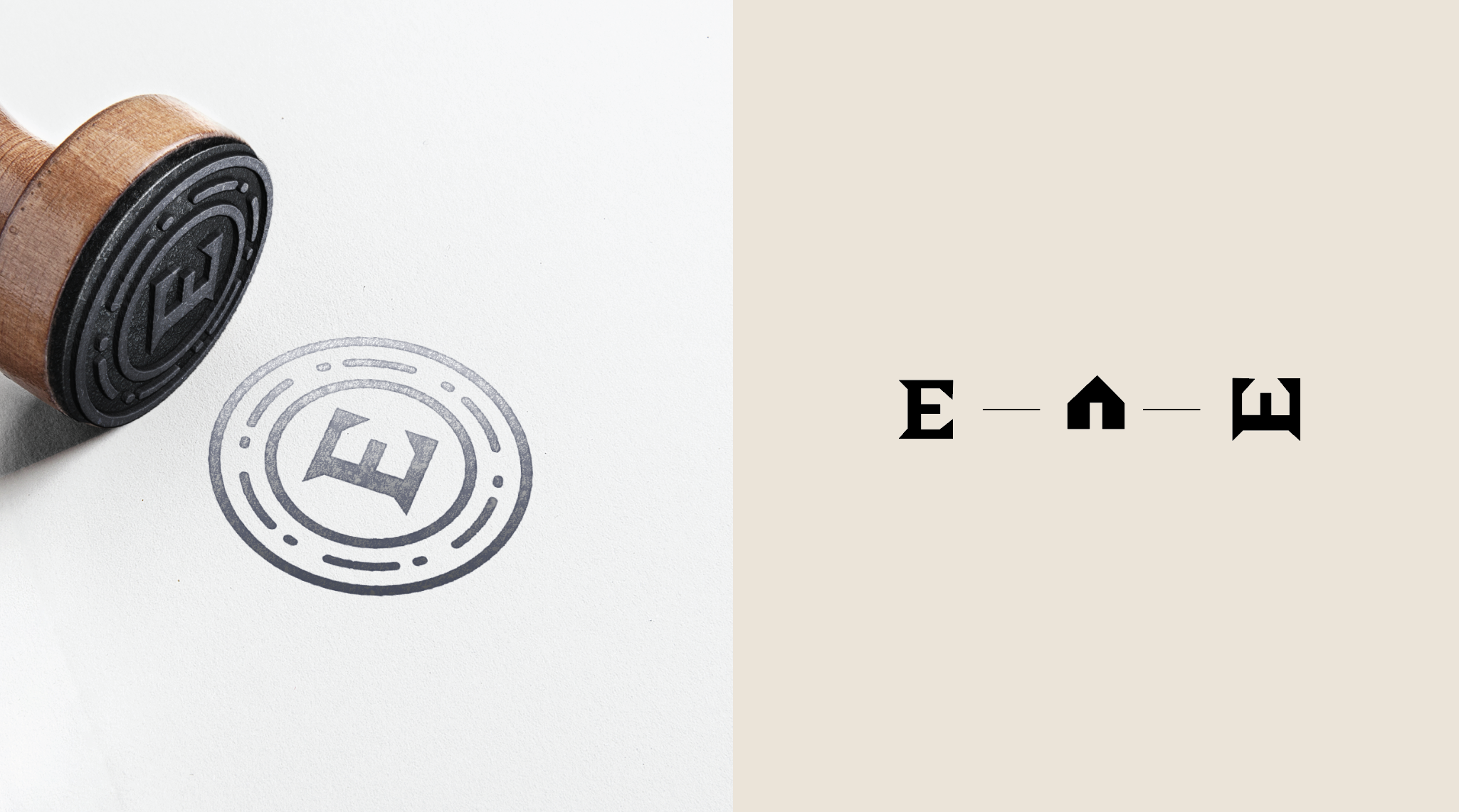
Who doesn’t love a fun little typography trick in a logo? The most memorable branding knows how to use imagery to stick in your mind: most of us know to look for an arrow in the FedEx logo, or noticed how Amazon uses a clever arrow to communicate that they have everything from a to z.
The latest fun word (or letter) play comes courtesy of Gitanos, who quite literally flipped the monogram for Costa Rican food company Santa Eulalia on its head. By tipping over a serif “E,” they reveal something clever tucked in the negative space: a little house that highlight’s the brand’s connection to the home.

Get unlimited access to latest industry news, 27,000+ articles and case studies.
Have an account? Sign in


