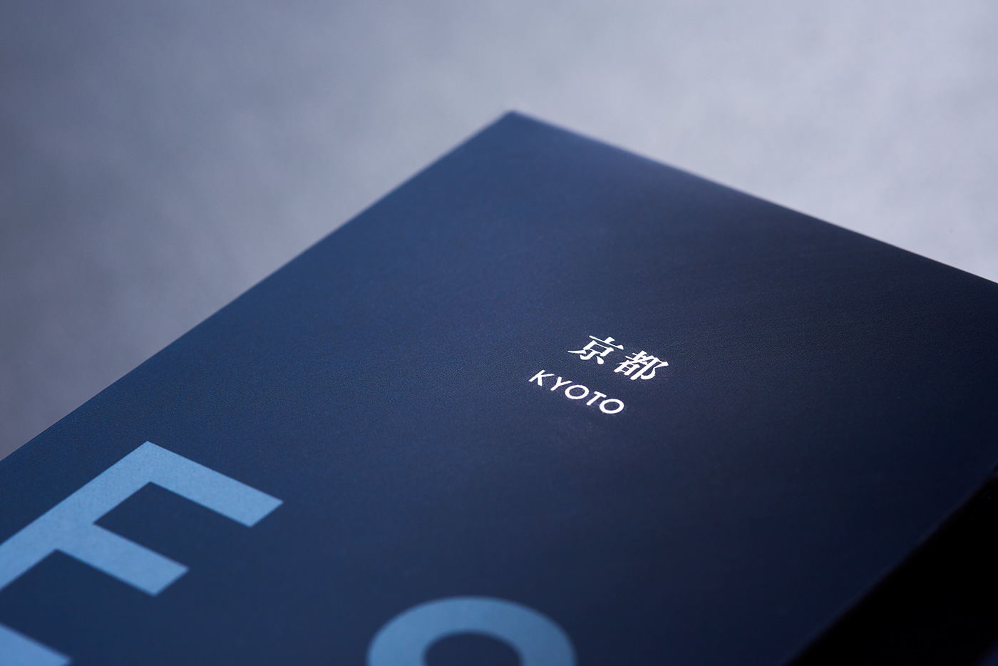
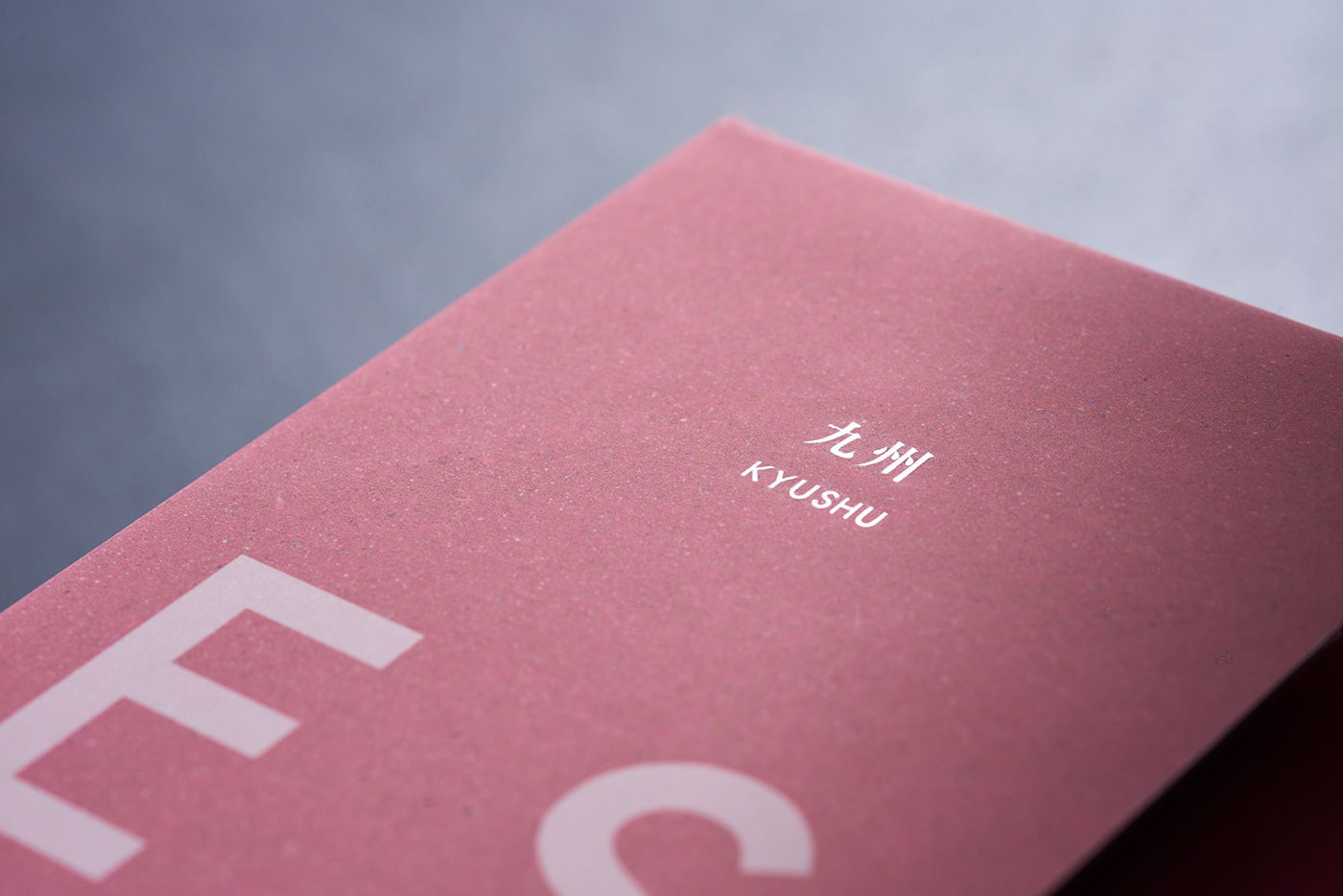
The elegance of Press Butter Sand’s packaging is not missed upon us. The sans-serif typeface wrapping around the rectangular, beautifully colored box is both unique and majestic in a way that genuinely makes this sweet feel like a treat. Designed by BAKE INC., this design is simplistic, modern, and refreshing in ways that all sweet treats should lean into. Treat yourself with Press Butter Sand; I know I want to.