This placeholder is removed when the ad slot is configured.

This placeholder is removed when the ad slot is configured.

This placeholder is removed when the ad slot is configured.

This placeholder is removed when the ad slot is configured.

This placeholder is removed when the ad slot is configured.

This placeholder is removed when the ad slot is configured.

Poggio del Farro Gets a Stylish 21st Century Rebrand from Auge Design

Published

Filed under

,

Don’t you wish all your food could look cool? Dare to dream— or do you have to? With the amount of funky, artful rebrands happening out there lately, the entirely aesthetically pleasing kitchen of our dreams might not be such a distant fantasy after all.

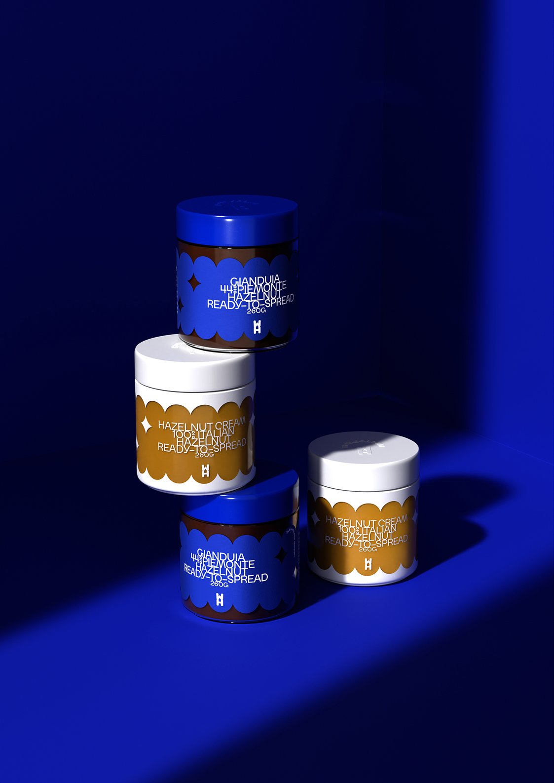
The latest entry in huge glow-ups is Italy’s Poggio del Farro, a company that bases their products around the super healthy whole grain farro. Auge Design helped the brand move from a dated “Tuscan-inspired kitchen in a 2000s McMansion” look to a much more stylish ’70s LA pop art vibe. A charming sun peeks behind an eclectic, abstract hill design that changes color and length based on the product in question, while the typography uses a modern, on-trend blend of sans and serif. Mom’s pantry has never looked cooler.

POGGIO_FARRO_BARRETTE-jpg.jpg

This placeholder is removed when the ad slot is configured.

This placeholder is removed when the ad slot is configured.

This placeholder is removed when the ad slot is configured.

This placeholder is removed when the ad slot is configured.

This placeholder is removed when the ad slot is configured.

This placeholder is removed when the ad slot is configured.