Persephone Biosciences Communicates The Seriousness of Science And The Optimism of Renewal
By
Published
Filed under
By
Published
Filed under

Project Description:
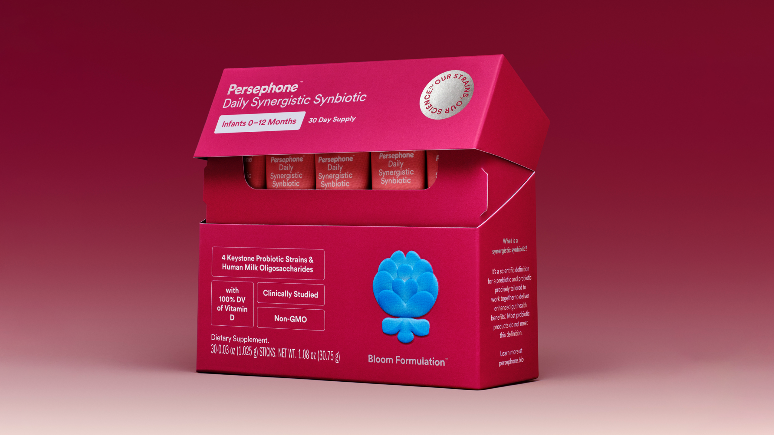
Persephone’s breakthrough product is a first-of-its-kind synergistic synbiotic for infants and toddlers. A synergistic synbiotic is a probiotic and prebiotic that are perfectly tailored to one another. These kinds of synbiotics are the next generation of gut microbiome care.
Persephone developed its products through the largest infant poop study ever conducted in the US. 48 states of baby poop in fact. Through the study, Persephone isolated resilient strains of bacteria critical to gut health. These are the strains in their products. Shockingly, more than 75% of the children in their study lacked healthy populations of these bacteria.
The brand mission, “Bringing the gut microbiome back into bloom,” connects the mythological inspiration—Persephone, goddess of renewal—with the scientific goal: restoring healthy bacterial growth. The packaging needed to communicate both the seriousness of the science and the optimism of renewal.

Key Design Elements:
Color Palette:
Deep Berry and Pomegranate reds anchor the system, referencing both the Persephone myth and the pomegranate’s prebiotic associations. These tones feel authoritative but warm. Peach and Off-White create space and keep the scientific content approachable rather than clinical.
Illustration as Differentiation:
Each variant is identified by a custom illustration that balances organic texture with structured symmetry—a visual expression of nature and science working together.
The infant “Bloom Formulation” features a budding blue flower.
The toddler “Thrive Formulation” features a fuller purple bloom.
These are not cartoon graphics, but refined, textural illustrations designed to resonate with both parents and pediatricians. The blooms reinforce the central idea: bringing the gut back into bloom.

Typography and Tone:
The type system carries a similar balance. Bookmania, a warm serif, is used for headlines to convey humanity. Circular, a clean geometric sans, handles technical information to ensure clarity. Selective italics emphasize emotionally resonant language, giving the scientific copy a note of conviction without overstatement.
The Heart of the Design:
At its core, the Persephone packaging mirrors the product itself—a synergistic solution. Warm, life-affirming visuals make the brand approachable for parents, while precise dosing, clear hierarchy, and disciplined typography establish scientific credibility. The result elevates the category from everyday digestive support to a foundational part of early health, expressed through a structure that is thoughtful, functional, and quietly confident.