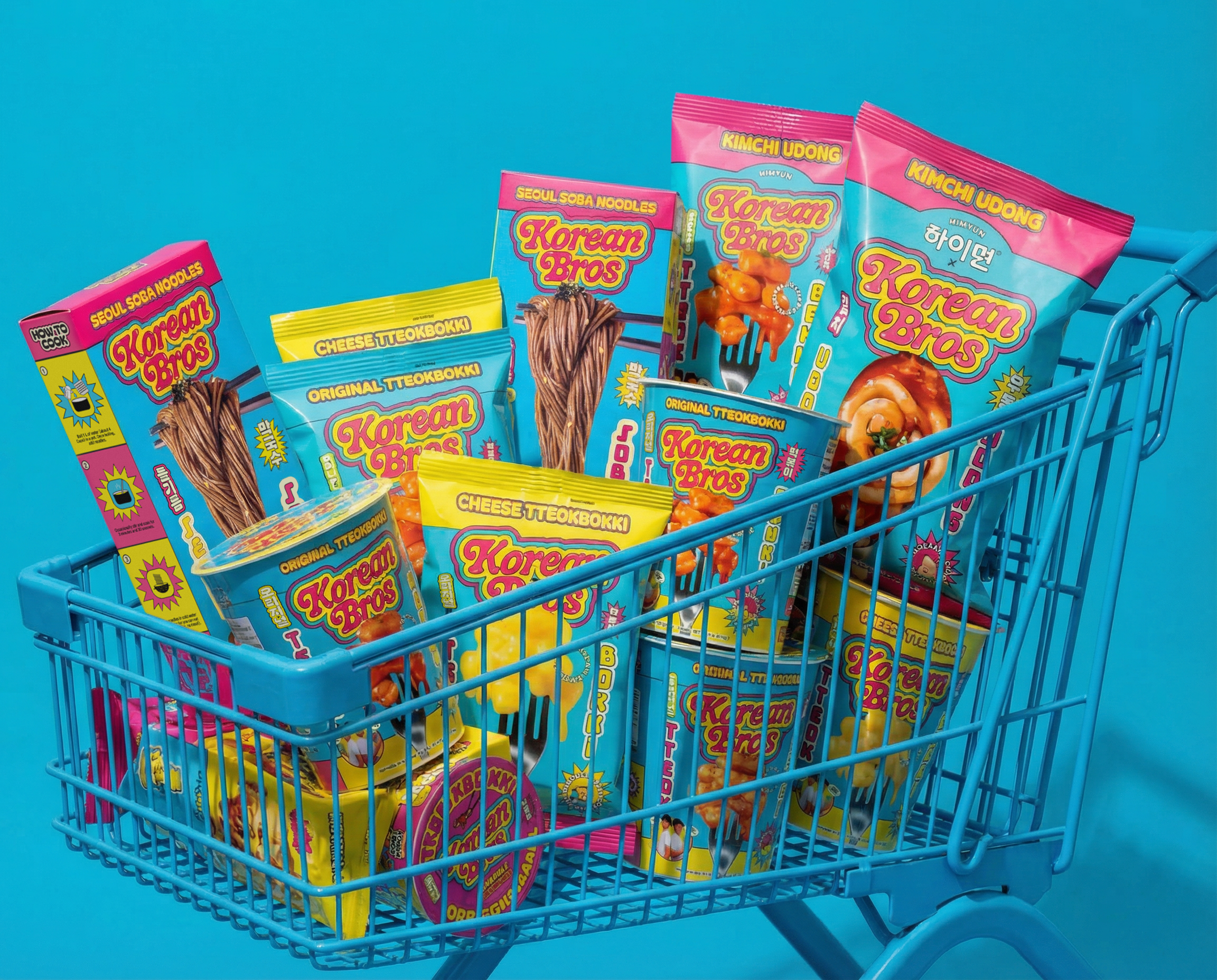
For Otoki, Chase Design Group transformed a Korean favorite into something vibrant and globally appealing, led by oversized, rounded typography and a simplified, more approachable logo.
The color palette shifts to bright tones like electric blue, orange, and pink, making each flavor instantly recognizable, while playful illustrations, like the cheese moon, add a touch of personality.
What sets this apart is how it blends cultural confidence with modern retail energy, creating a system that feels fun, highly shoppable, and perfectly in sync with the global rise of Korean food culture. And craveable enough for anyone to want to pick up a bag. Or five.