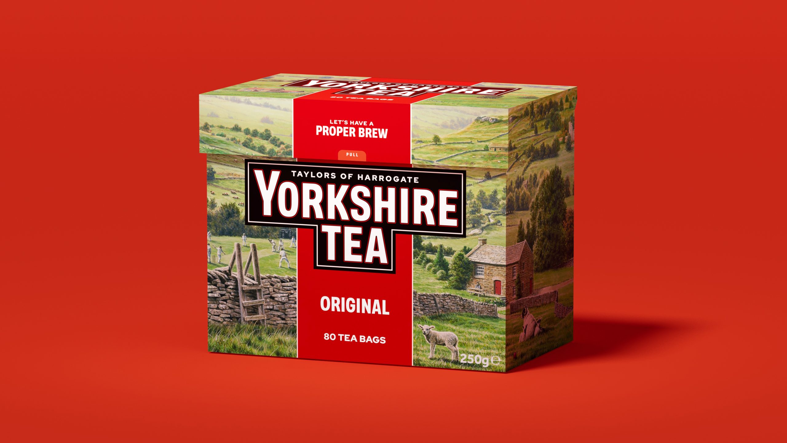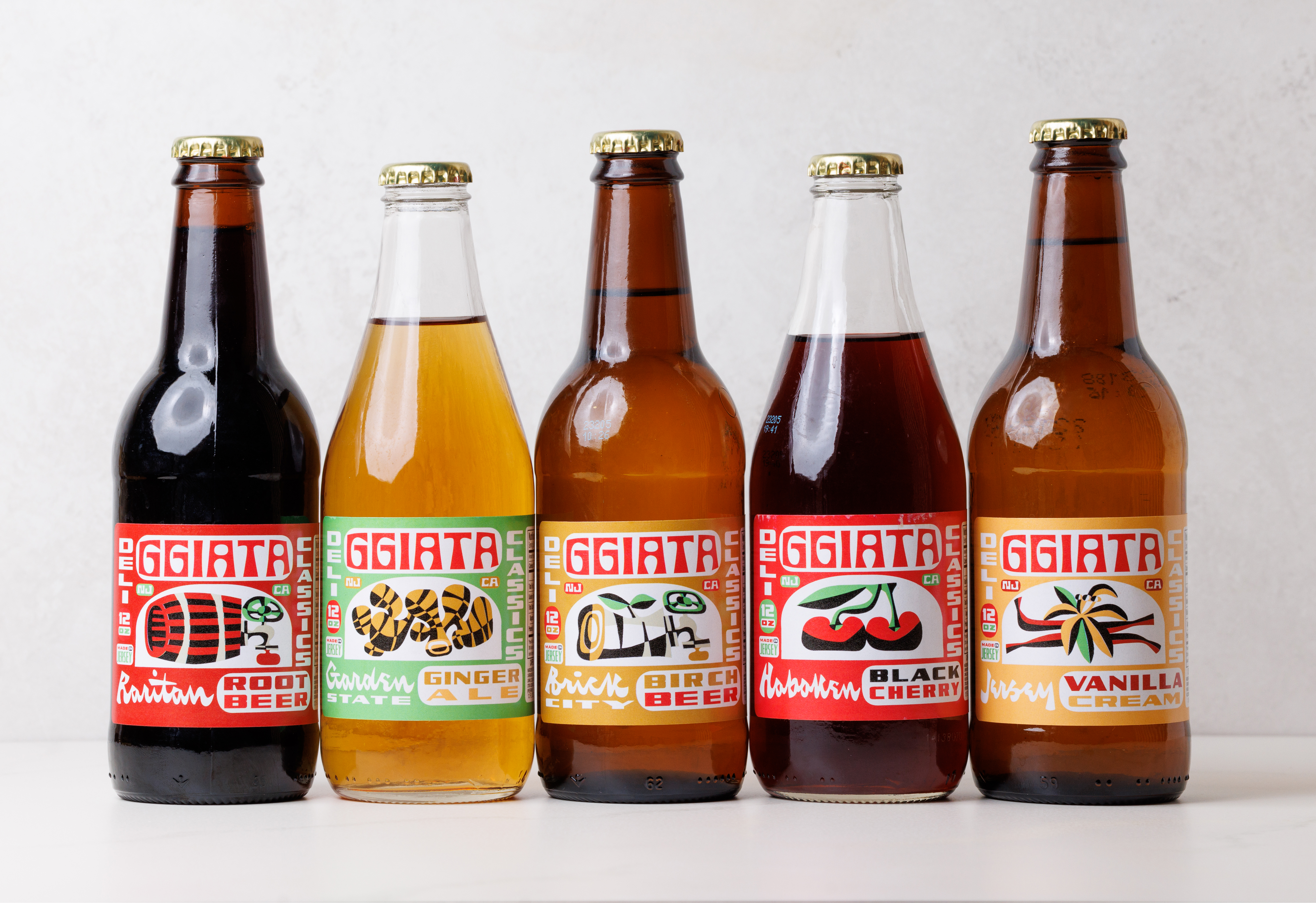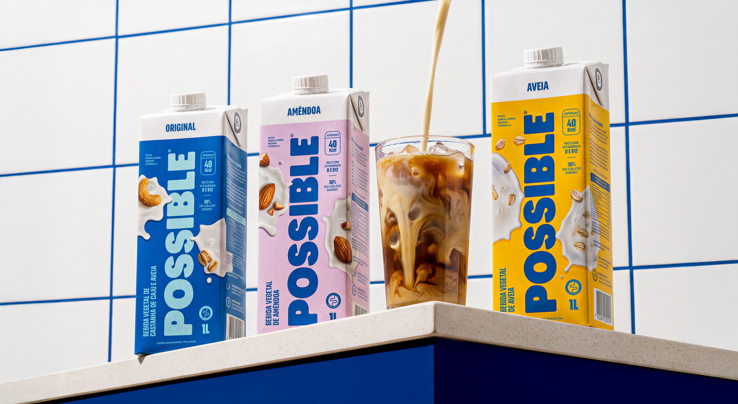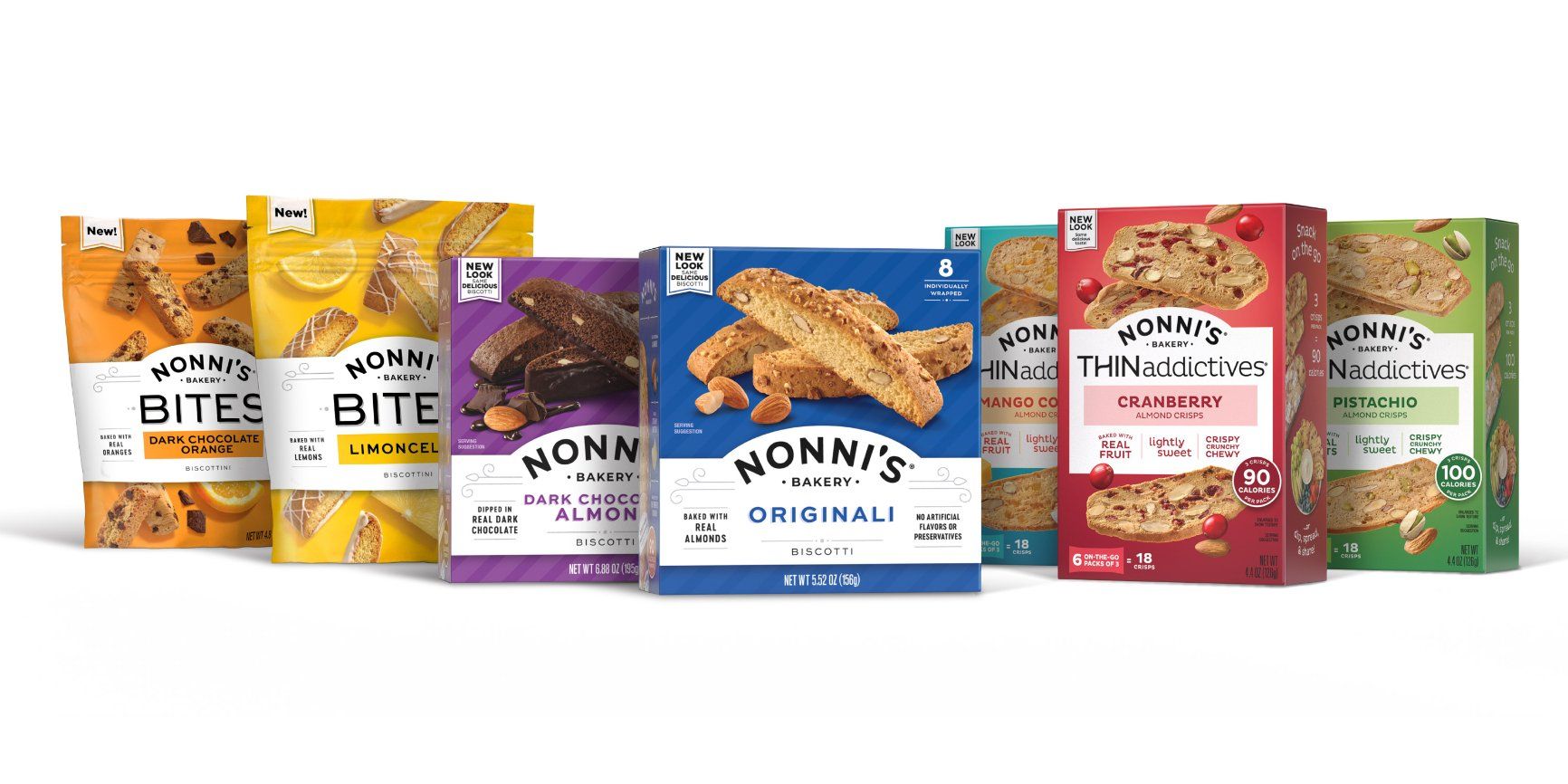
While many redesigns take a light, subtle enough touch that it can be hard to tell what changed, there’s no mistaking that America’s most popular biscotti brand has an entirely new look. Sterling Brands gave Nonni’s Bakery a confident redesign that trades handwritten script for more modern sans serif typography, brightly colored packaging, and an understated wheat motif by the logo. The new wordmark looks not unlike the sign above a beloved neighborhood bakery, honoring the brand’s European roots and well-earned reputation as a go-to purveyor of crunchy Italian cookies.
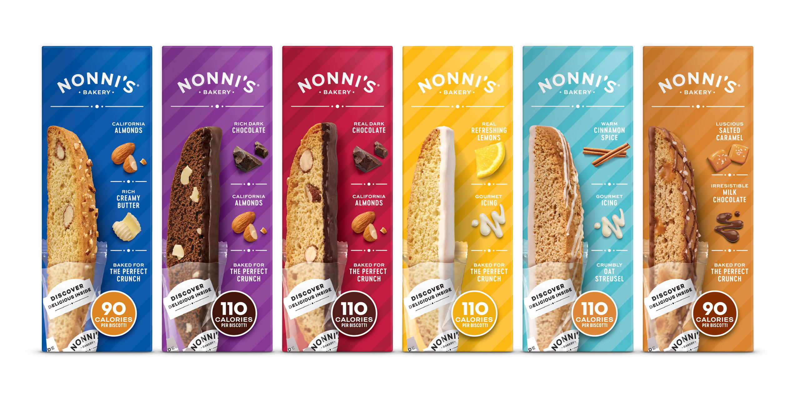
Nonni’s Bakery is the #1 biscotti brand in the U.S. with an ambition to grow the business beyond their very loyal biscotti-lovers. To catapult the brand into new categories, Sterling repositioned Nonni’s as a contemporary Italian bakery brand and developed a flexible portfolio architecture to capture market opportunity across Italian baked goods, better-for-you snacks, and beyond.