THIS IS IT! DIELINE Awards 2026 Late Entry Deadline Ends Feb 28
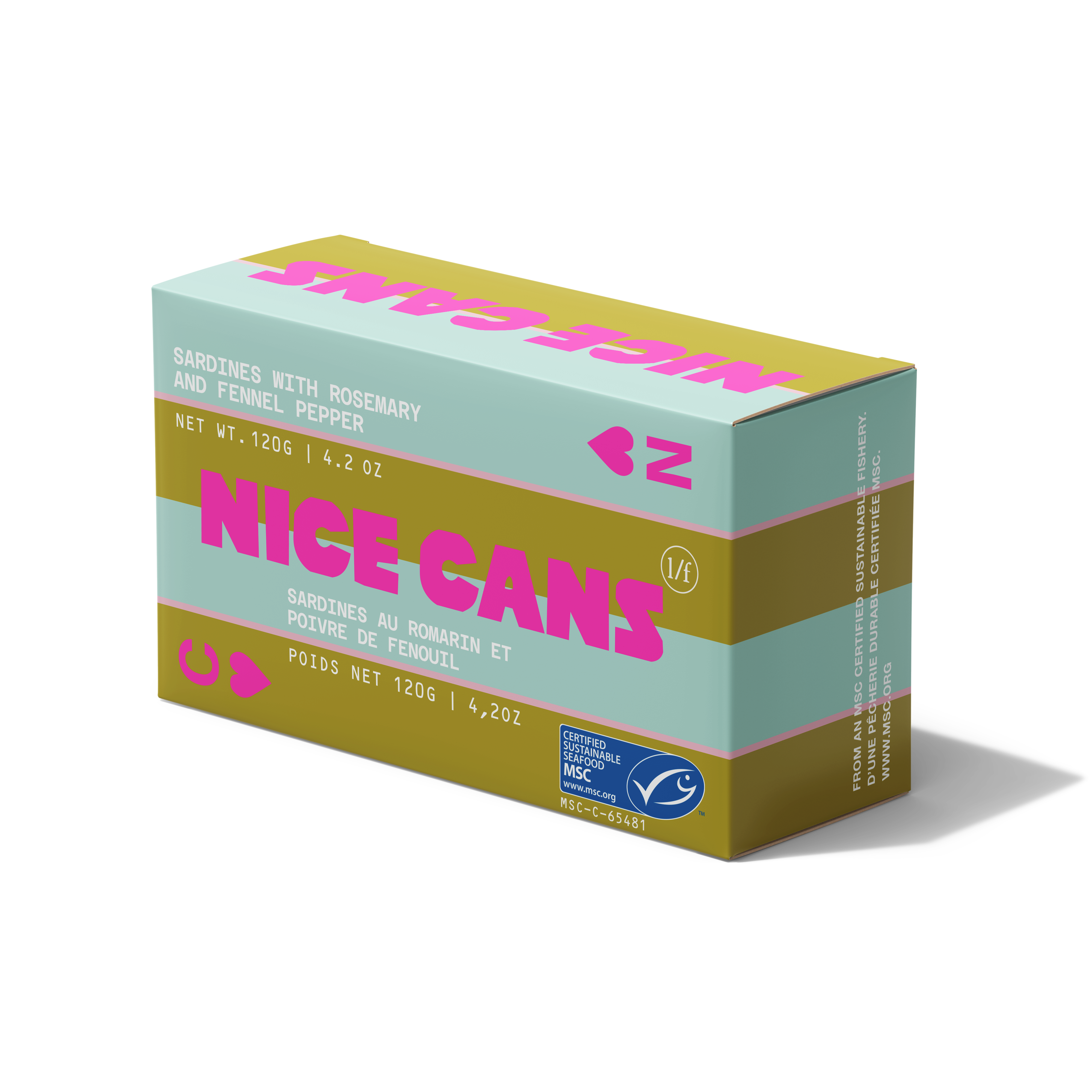
Nice Can’s packaging, designed by BRANDSICLE, serves up a bold take on tinned fish with witty copy. The redesign swaps conventional designs for vivid color palettes and playful typography. The new design incorporates bright, saturated hues and dynamic layouts highlighting the brand’s quality and sustainability.
The use of fully recyclable aluminum and FSC-certified paper highlights the brand’s commitment to smart sourcing, and by combining artisanal charm with innovative design, Nice Cans transforms canned seafood into a product with more of an elevated, playful take.
Stephen Michlits, Creative Director of Brandsicle, shares a bit about the design process below.
Get unlimited access to latest industry news, 27,000+ articles and case studies.
Have an account? Sign in