THIS IS IT! DIELINE Awards 2026 Late Entry Deadline Ends Feb 28
Monte Marea Makes the Coolest Use of Tequila’s Obligatory Agave Icon We’ve Seen Yet
By
Published
Filed under
By
Published
Filed under
Tequila design has been leaning into its heritage lately, with a strong emphasis on looks that highlight spiritual, indigenous connections to the drink. Latin American brands and studios have obviously been doing it better than anyone else, considering their immediate connections to the land most immediately associated with the classic liquor. Lovingly detailed labels feature the rich iconography associated with the Mayans and Aztecs, and they’re often accented with irresistible, on-target gold foil.
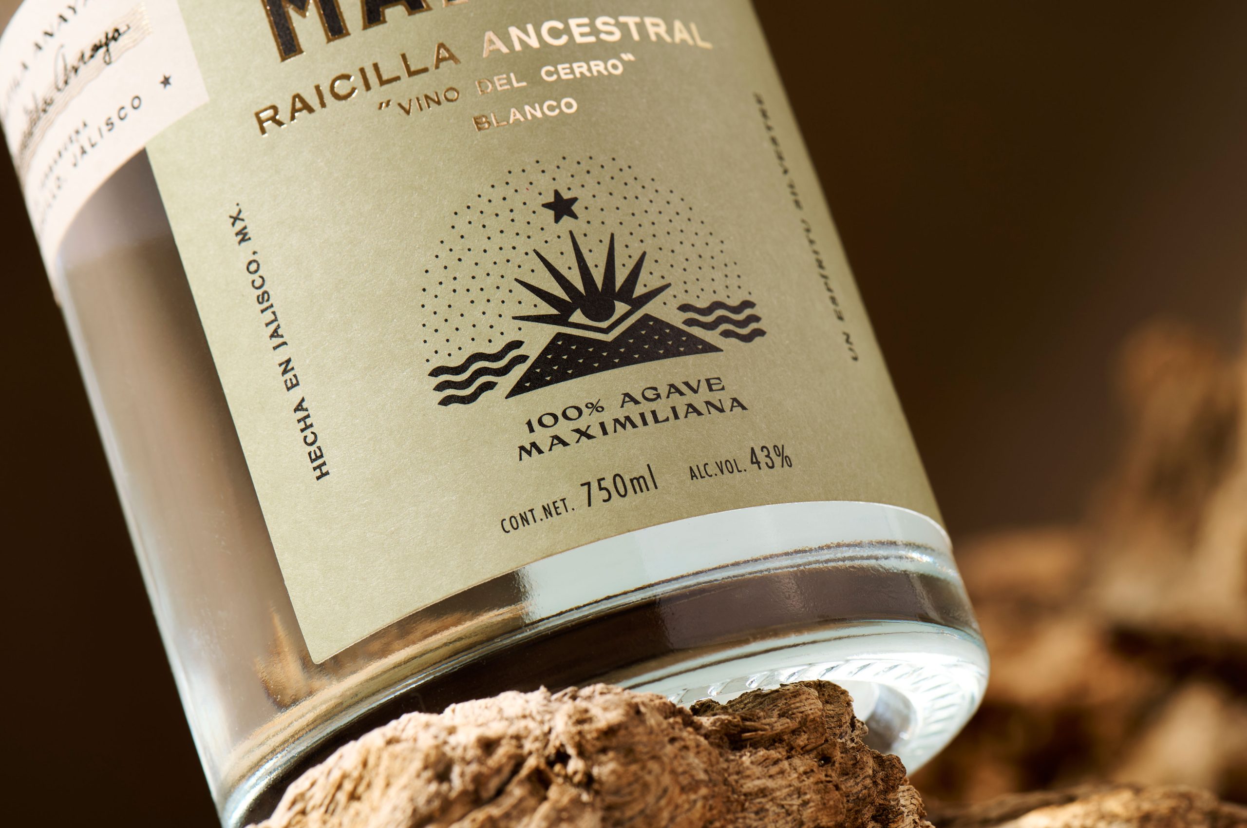
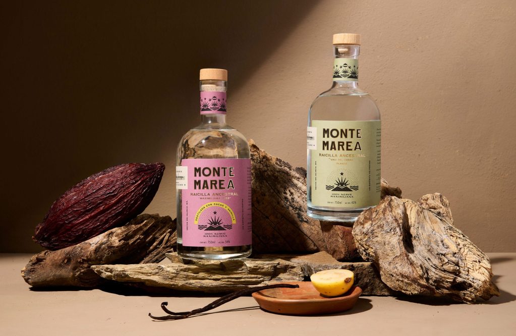
Menta’s design for Monte Marea is one of the coolest examples we’ve seen lately, with simple, sophisticated art that still feels trippy and dynamic. The branding makes very interesting use of the agave icon that feels de rigeur for tequila at this point, turning it into the sparkle of an ancient pyramid’s all-seeing eye. They obviously know they had a great idea here, as this conscious agave also the graces the bottle’s cork and neck. While there are plenty of other details we could mention, bright variable labels and shiny gold text are some of the best parts.
Get unlimited access to latest industry news, 27,000+ articles and case studies.
Have an account? Sign in


