THIS IS IT! DIELINE Awards 2026 Late Entry Deadline Ends Feb 28
Mezcal Tierra de Nadie’s Aztec-Inspired Design Makes Tradition Look Exciting
By
Published
Filed under
By
Published
Filed under
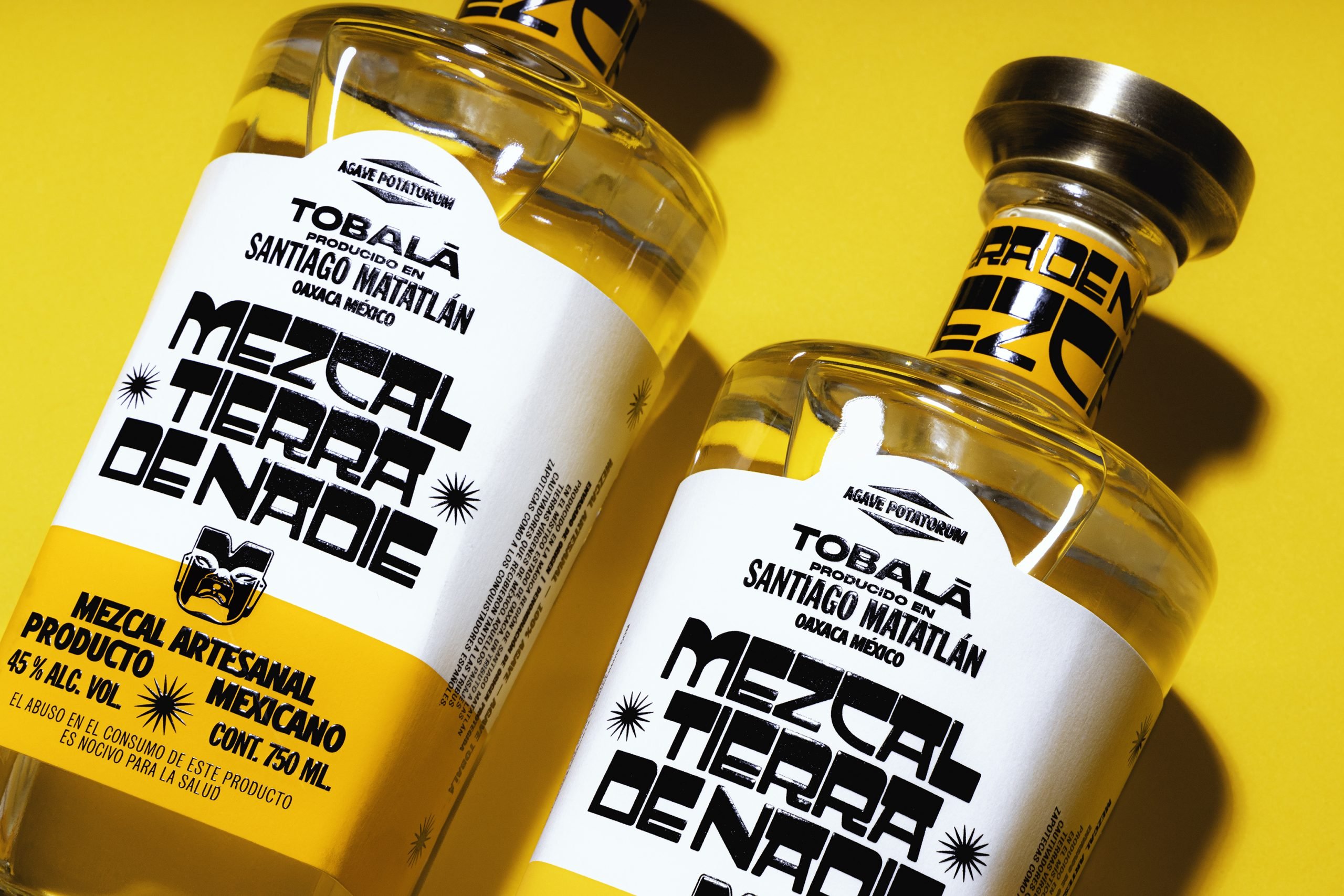
Big, bold, angular type is the star of Monotypo Studio’s eclectic design for Mezcal Tierra de Nadie. This warm, regal bottle honors Mexican culture with illustrations and carvings of ancient deities, a reverent solar yellow, and the funky Aztec-inspired bespoke typeface. No detail of this sophisticated design is boring, from the vibrant yellow bottleneck label to the shiny, engraved metal cork.
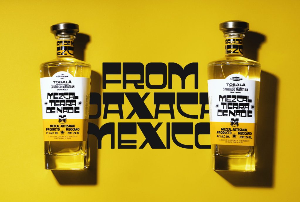
Corporate Identity Project for a handcrafted Mezcal brand. This brand was made with a strong Mexican inspiration, creating an alphabet inspired by the hand-painted signs located in the capital of Oaxaca, as well as the pre-Hispanic and Hispanic culture of the colonial era and the tradition of the poster of independent Mexico. Our goal was to create a product that strongly, powerfully and modernly reflects the rich Mexican cultural heritage.
Get unlimited access to latest industry news, 27,000+ articles and case studies.
Have an account? Sign in


