A red and yellow color combination is bound to make an impact. The warm hues radiate off each other unexpectedly yet utterly approachable manner. Atipus Studio thoughtfully implemented the combination in the packaging design for Mejunje. The wine’s label takes influences from women’s traditional costume neckerchiefs as well as bullfighting poster aesthetics. The result is a geometrical and type-driven design that’s cultured yet animated.
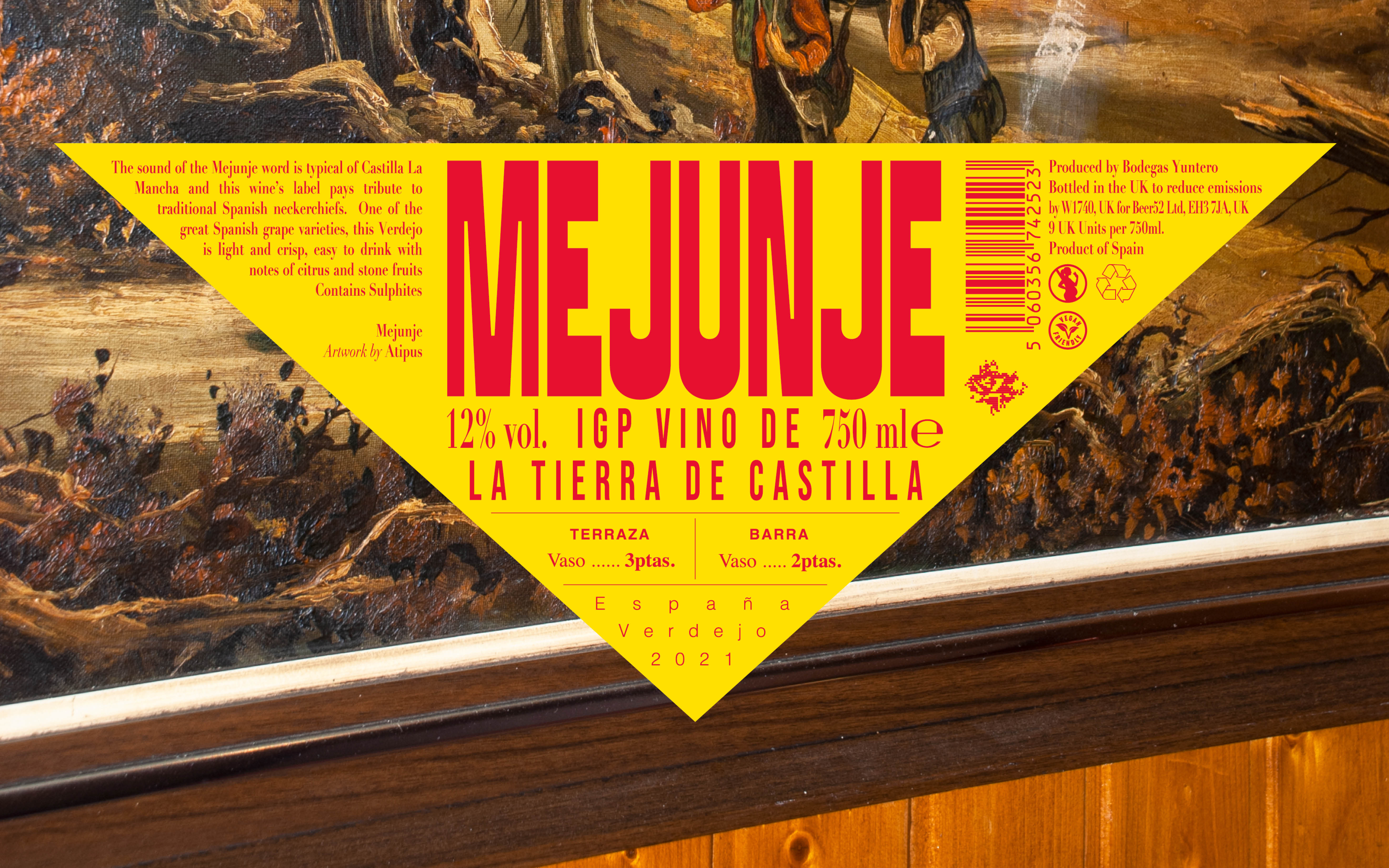
Wine52, the UK’s largest wine discovery club, approached us and four other studios from Spain, to create a collection of wines from the D.O. La Mancha distributed between the Anglo-Saxon market. We had to work on its naming and the graphic universe.