THIS IS IT! DIELINE Awards 2026 Late Entry Deadline Ends Feb 28
Mate Maker’s Values Are Translated Through Its Organic-Inspired Packaging System
By
Published
Filed under

By
Published
Filed under
If you’re going to drink, at least drink something that embraces transparency. Mate Maker is a hard kombucha brand that created a brand centered on sustainability, transparency, and health. The packaging, designed by Break Maiden, reflects these values through a design system that feels organic yet approachable with stunning beachy notes.
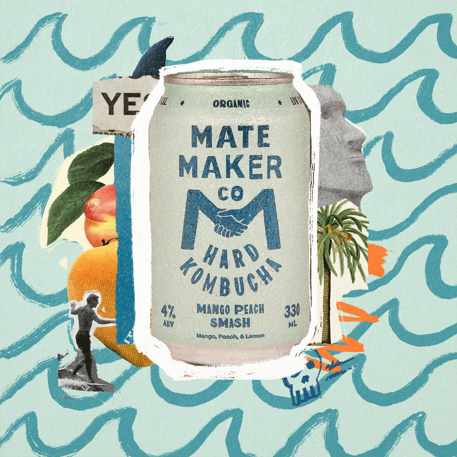
Mate Maker Co was born from the question: if you choose to drink, why not drink better? In early 2020 Justin Medcraft, the electronic trio RÜFÜS DU SOL, and Tom Appleton set out to answer that question by creating Mate Maker Co: a clean label Hard Kombucha that embraces transparency. In-keeping with the idea of transparency, we designed and centered the brand and packaging around the iconic M monogram which symbolizes Mate Makers mission of creating organic, sustainably minded drinks that bring people together. In addition, we developed a robust visual style of typographic lockups and various coastal inspired elements to bring the brand to life outside of the packaging.
Get unlimited access to latest industry news, 27,000+ articles and case studies.
Have an account? Sign in


