THIS IS IT! DIELINE Awards 2026 Late Entry Deadline Ends Feb 28
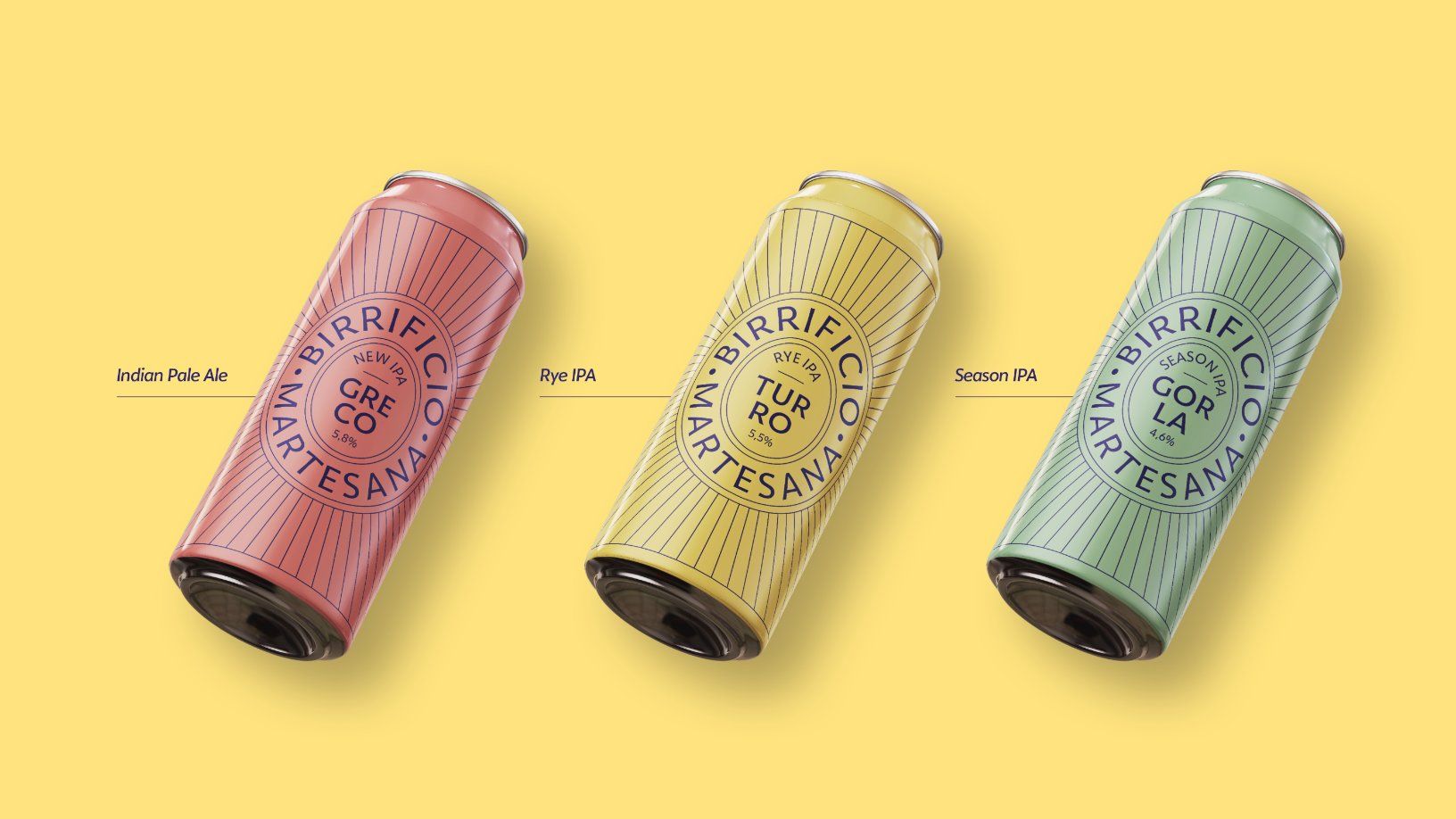
The can design for La Martesana is a symmetrical marvel, with each of the three brews utilizing a hero color to denote flavor. The template design finds the slightly serif font circling the hero of the design: The hollowed out star. The design is clean and straight-forward, yet visually arresting, making it the perfect beer to crack open after a long day.
La Martesana is a 15th century canal that crosses Milan from the outskirts to the city center, passing through a popular area that is transforming at very fast pace due to the arrival of many young creatives.
This project explores the iconic potential of an imaginary local brewery located in that area, through the brand design and all of the communication devices needed for the marketing of its beer.
Get unlimited access to latest industry news, 27,000+ articles and case studies.
Have an account? Sign in


