THIS IS IT! DIELINE Awards 2026 Late Entry Deadline Ends Feb 28
Magma Turns Up the Heat on Hot Sauce with Fiery Design Flair
By
Published
Filed under
By
Published
Filed under
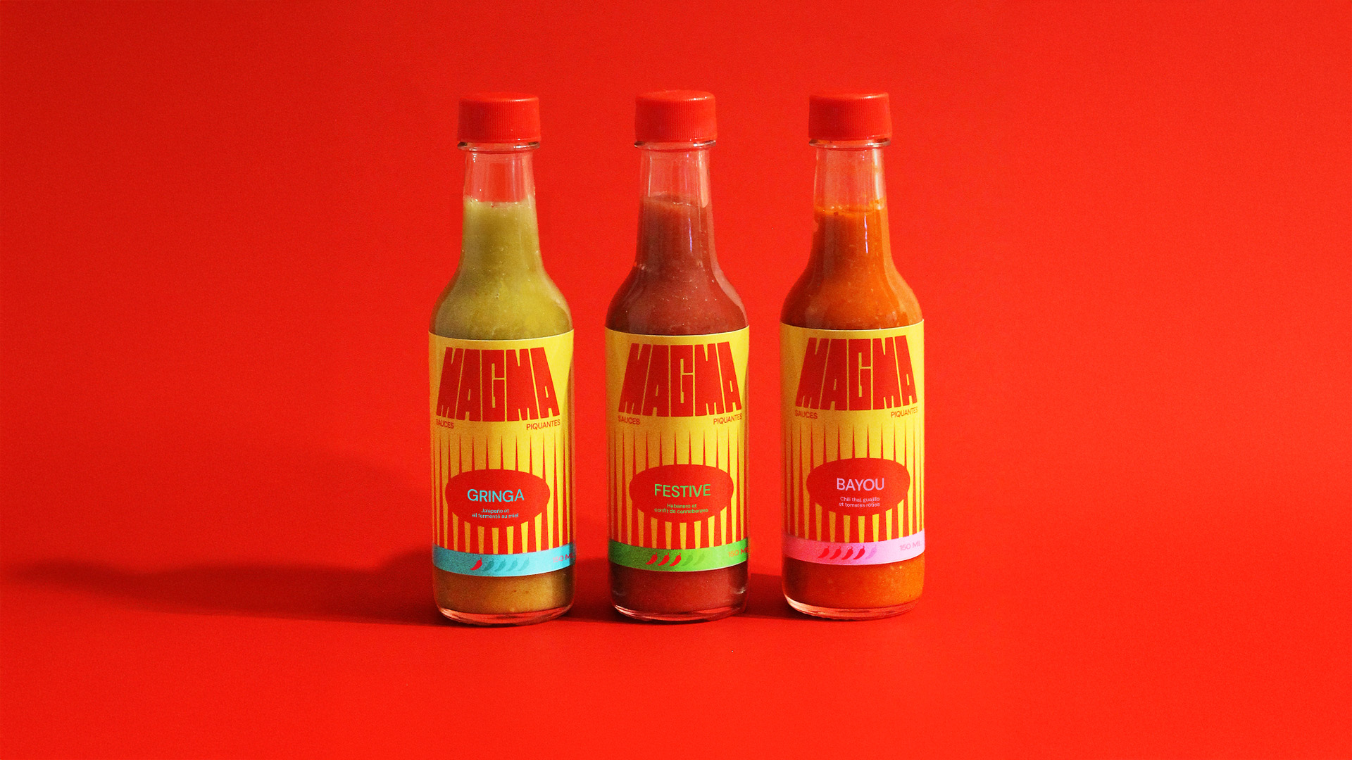
Magma Hot Sauces gets a packaging system that feels ripped from a late-’70s gig poster or a cult-classic grindhouse title card. It’s loud, graphic, and impossible to ignore in all the best ways.
Designer Sarah-Jeanne Turgeon leaned into stretched, blocky typography that looks like it’s melting under its own heat, paired with vertical, flame-like strokes that read almost like they belong on a retro sci-fi set. The neon accents, including teal, lime, and hot pink, break the category’s usual black-and-red monotony, giving each flavor a distinct signal. It’s clear that this is a hot sauce, but it’s definitely easily differentiated from the mass-market brands.
Get unlimited access to latest industry news, 27,000+ articles and case studies.
Have an account? Sign in


