Land’s Striking Typography and Earthy Tones Define Maazah’s Distinctive Packaging
By
Published
Filed under
By
Published
Filed under
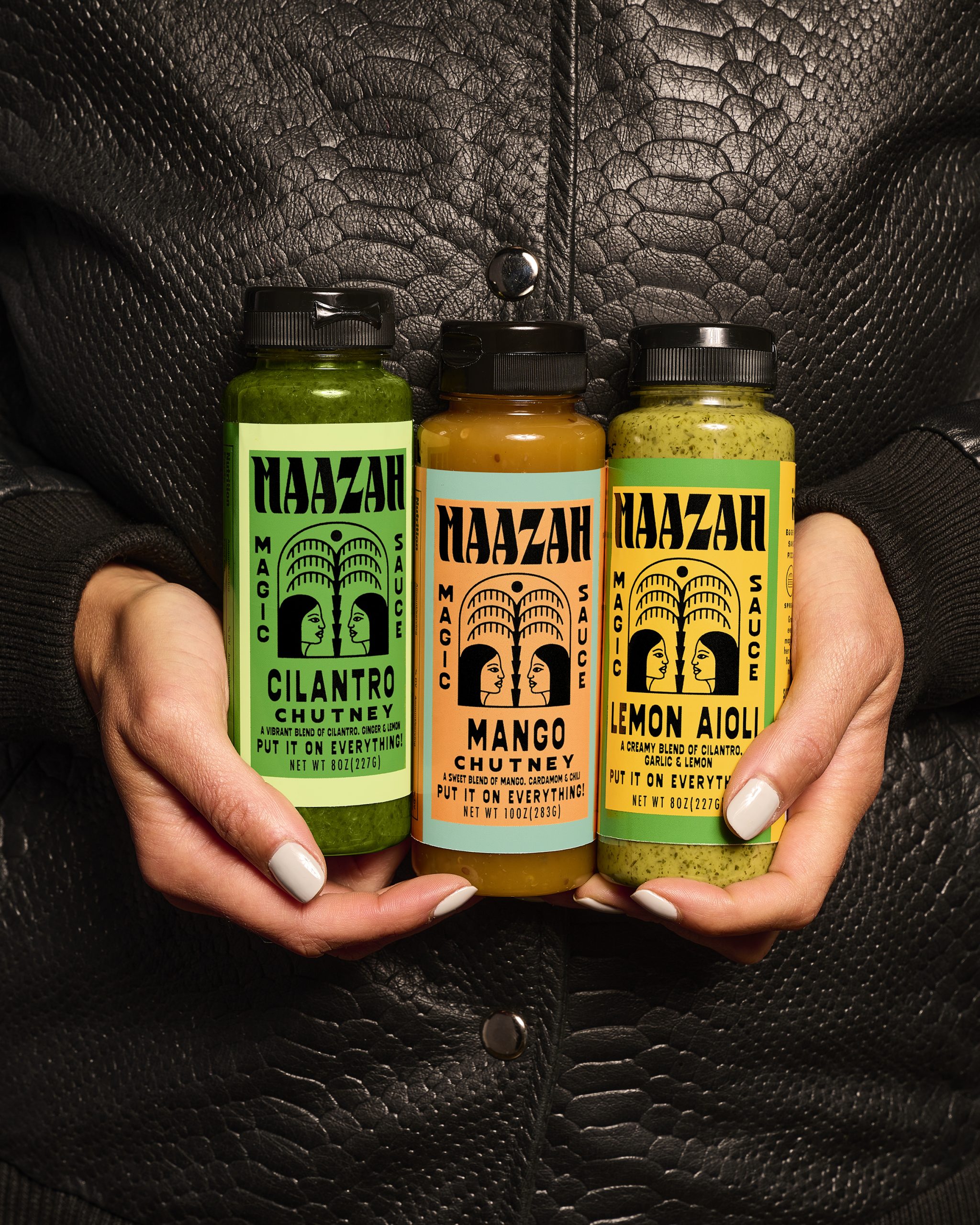
Maazah’s packaging, designed by LAND, has a bold, eye-catching look that feels both personal and authentic. The typography has an effortless, hand-drawn style that gives it a friendly aesthetic and makes it stand out amongst the sea of sauces on the shelf. Each product is wrapped in a vibrant, earthy color—like greens, oranges, and reds—matching the bold, natural flavors inside.
Plus, the layout stays clean, with the “Maazah” logo in big block letters and a little icon of two faces, adding a unique touch that makes the brand feel approachable and fun.
Ryan Rhodes, partner and Designer at LAND, told us more about the design process.
Get unlimited access to latest industry news, 27,000+ articles and case studies.
Have an account? Sign in


