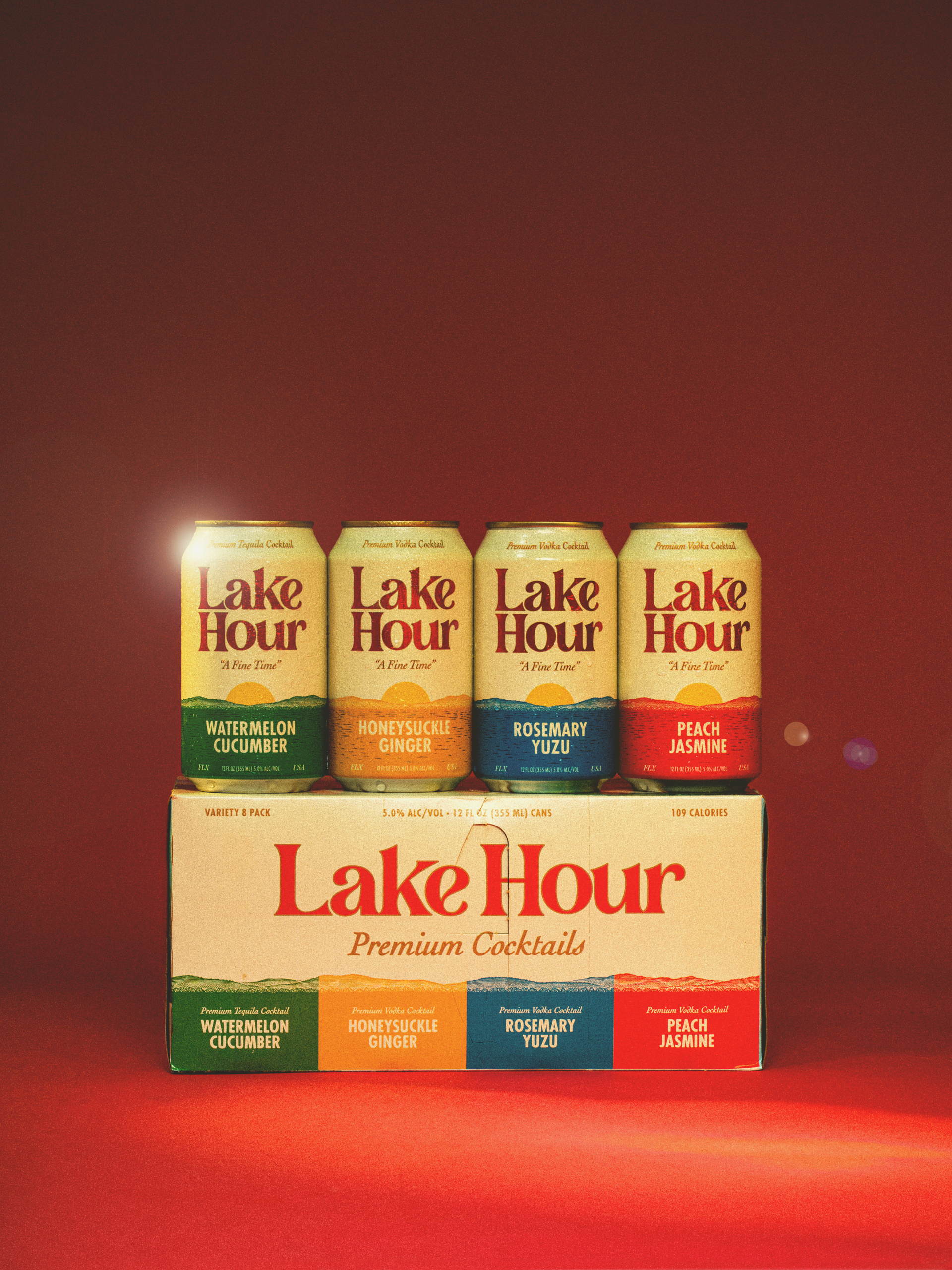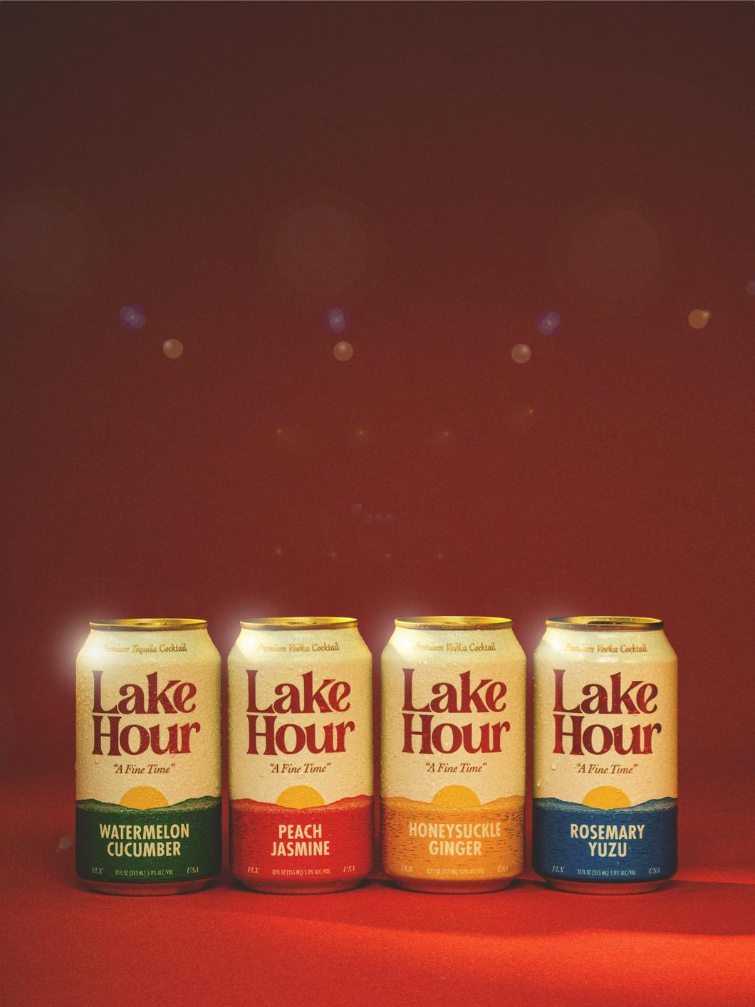
Lake Hour’s packaging for their aluminum cans is a harmonious blend of cream on the upper portion and a colored lower third that resonates with the drink’s flavor profile. The brand’s logo, presented in a chunky serif typeface, perfectly encapsulates its laid-back vibe. The design was created in collaboration with Helms Workshop, led by Christian Helms and Ryan Kitchens.
The packaging features colors that evoke a nostalgic ’80s and ’90s beer can aesthetic while retaining a unique charm for a mixed canned cocktail. Balancing graphic design with Stephen Noble’s evocative illustrations, the packaging’s horizon line is adorned with subtle nods to family legacies, creating a captivating tapestry of visual storytelling.