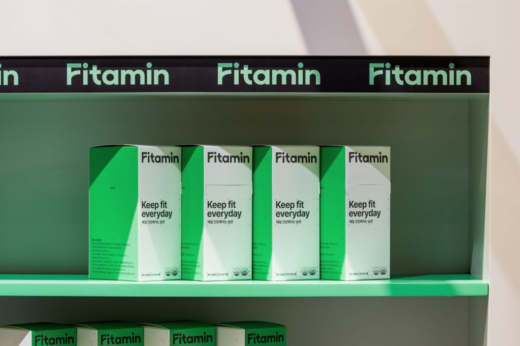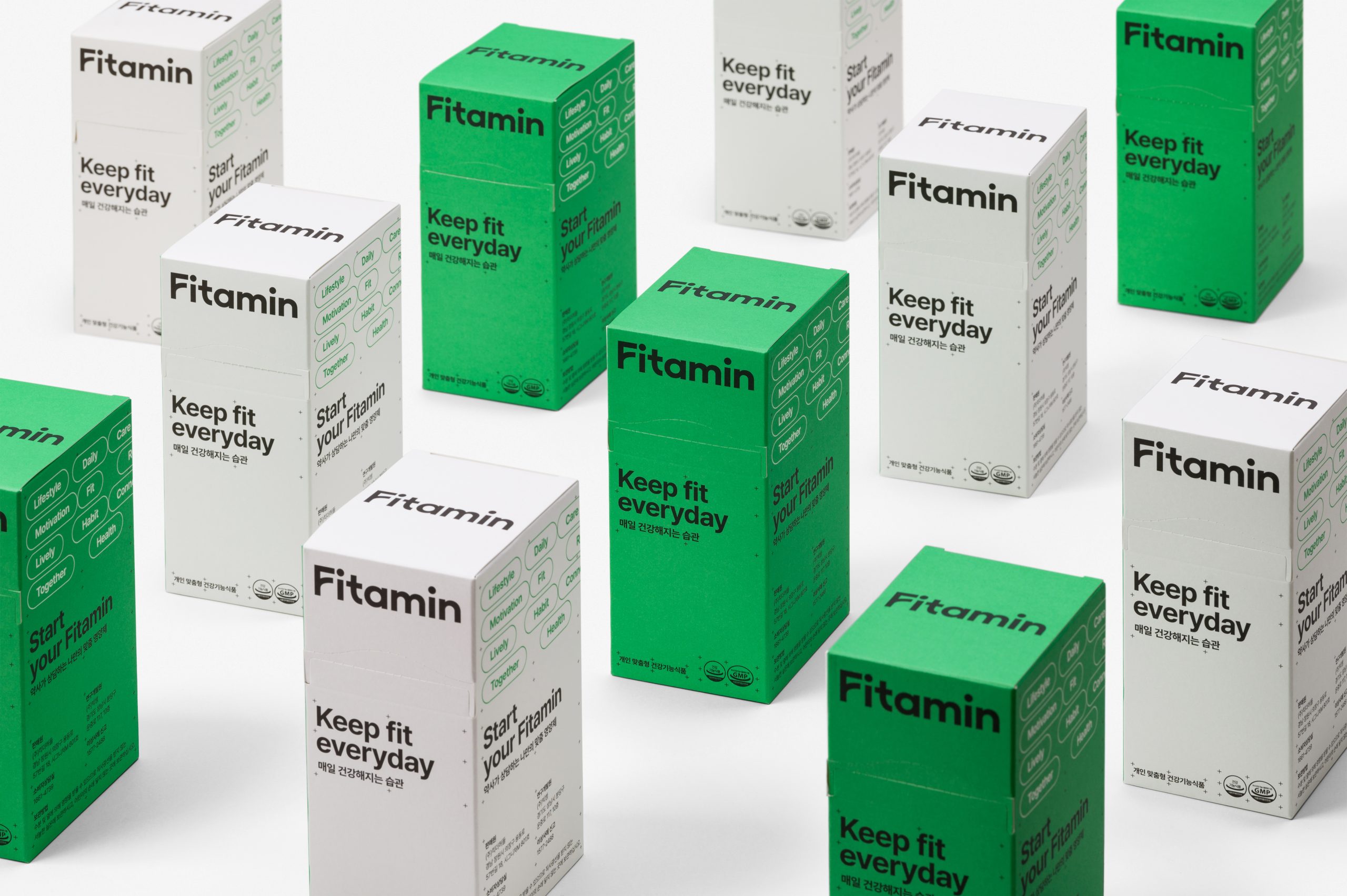
Seoul’s ORDINARY PEOPLE designed a sleek, no-nonsense look for Fitamin, a line of energy supplements. While the boxes come in a variety of pleasant rainbow hues, the system leans on a fresh Kelly green for a classically earthy look.
Lining up with the brand’s clear interest in science, the design is clean-cut, symmetrical, and efficient. The logomark keeps it interesting by deviating a little from the Helvetica-esque look of the rest package, presenting a slightly curvier, more modern take on sans serif.