THIS IS IT! DIELINE Awards 2026 Late Entry Deadline Ends Feb 28
Kill Devil Rum’s Packaging Is A Maritime Treasure
By
Published
Filed under
By
Published
Filed under
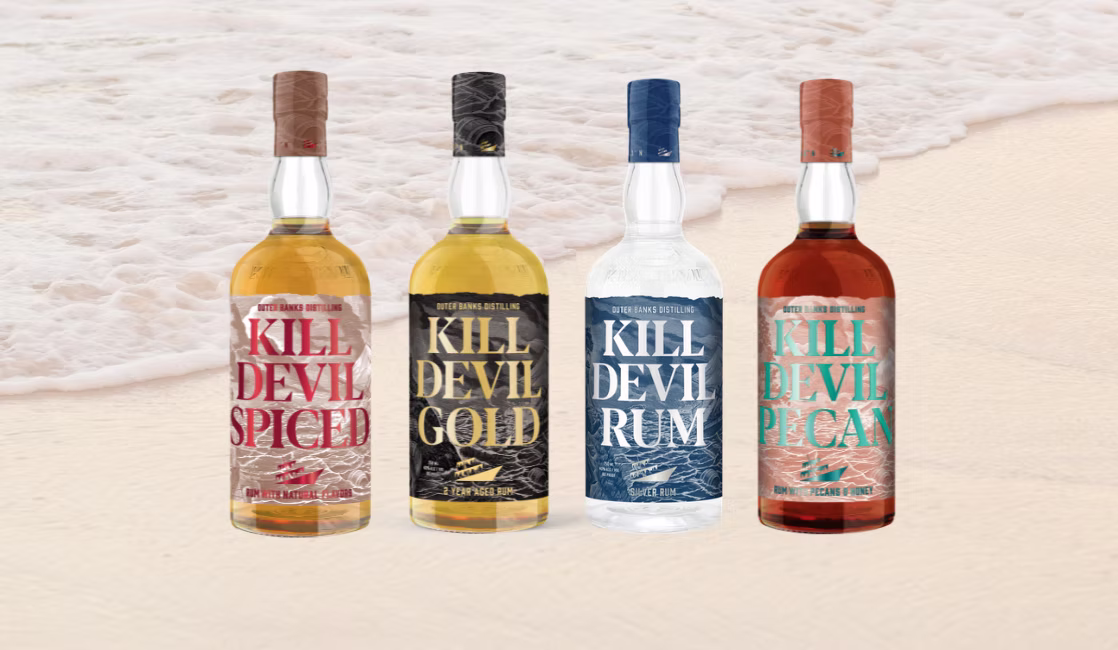
Outer Banks Distilling’s Kill Devil Rum packaging, designed by Creature Theory , leans into its coastal roots through layered textures and foiled typography. The oversized, serif-heavy lettering commands attention, sitting against an intricate backdrop of illustrated ocean waves.
Each variant gets its own color scheme, think deep blue for silver rum, aged gold for the 2-year, and a textured copper for the pecan-infused edition. The bottle caps extend the storytelling with etched details, resembling nautical maps or aged barrels. The whole look is full of movement, echoing the brand’s seafaring inspiration.
We spoke with Matt Ebbing, founder and chief creative director of Creature Theory, about ditching pirate cliches and deep-diving into shipwrecks.
Get unlimited access to latest industry news, 27,000+ articles and case studies.
Have an account? Sign in


