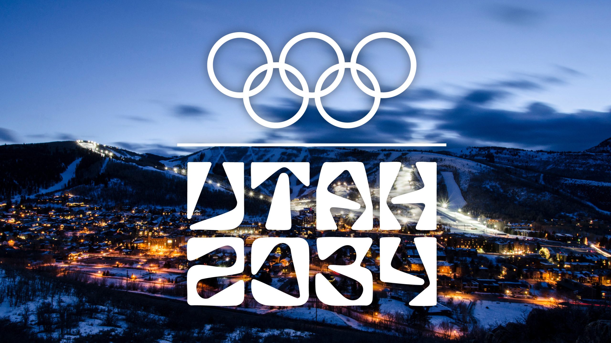
I was genuinely hoping I could make it through the rest of the year without having to stare down a “controversial” logo or redesign for a restaurant chain no one actually cares about. Unfortunately, while the team was enjoying our Thanksgiving break and taking a much-needed vacation from Instagram, LinkedIn, and Bluesky—essentially, anywhere someone might have a design opinion™ —the 2034 Utah Olympic and Paralympic logo dropped.
Yes, unveiled last week when I was setting my OOO on Monday, the 2034 Organizing Committee revealed the logo for the winter games. Developed by a team led by Salt Lake City designer Molly Mazzolini (of Elevate Creative), the wordmark’s letterforms are said to be inspired not only by the landscape of Utah but also by athletic bodies in motion, all things that make sense for an Olympic logo.


1 response to “It’s OK To Like the 2034 Utah Olympics Logo”
That is awful what the heck was that designer thinking