Interact Retains Grüns’ Credibility With Redesign, But Injects Some Much-Needed Fun (and Gummy Bears)
By
Published
Filed under
By
Published
Filed under
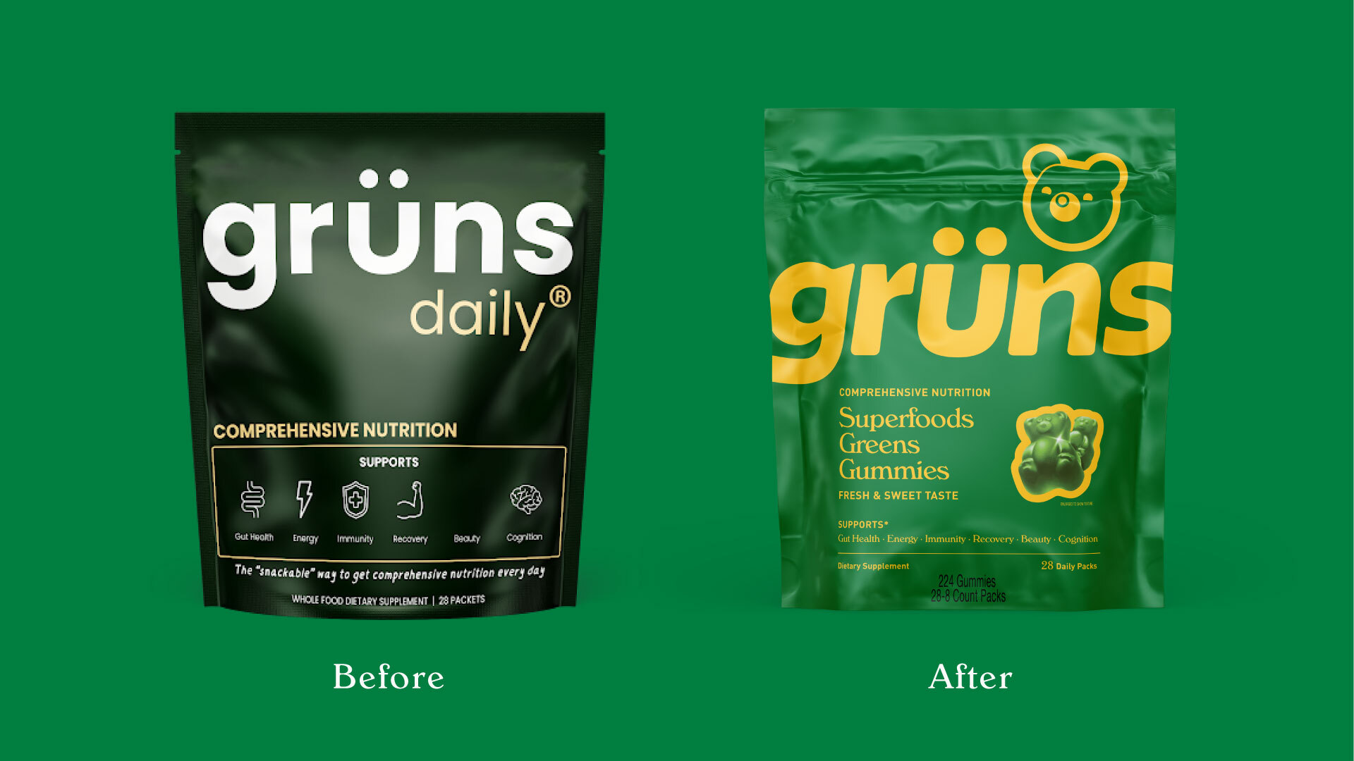
Maintaining hard-earned credibility while showing your not-so-serious is a difficult tightrope to walk. when it comes to branding. You want folks to know that you mean business, but you also want them to genuinely like you.
Designed by Interact, Grüns introduces a fresh and playful new identity and packaging system while retaining its scientific bonafides.. The redesign replaces a straightforward and clinical look with a bold logo featuring softened edges, paired with a bright and energetic color palette to enhance approachability. A new bear-shaped logo epitomizes the gummies, creating a memorable mark that appeals to both existing fans and new customers.
The addition of a kids’ line is differentiated through unique colors, iconography, and naming, all while maintaining a cohesive portfolio look. By refining the typography and adding gummy imagery with clear benefit callouts, the new design balances taste appeal with nutritional transparency.
Get unlimited access to latest industry news, 27,000+ articles and case studies.
Have an account? Sign in


