THIS IS IT! DIELINE Awards 2026 Late Entry Deadline Ends Feb 28
Freia Premium’s Playful Elegance and Taste Differentiation Through Packaging
By
Published
Filed under

By
Published
Filed under
Dinamo Design’s packaging for Freia Premium stands as a vibrant testament to the rich history of the Norwegian chocolate brand. By reintroducing the iconic marabou stork, originally featured in 1907, as a central figure, the design ties together the brand’s heritage and premium positioning. The brighter and more colorful touch not only makes the premium range easier to discover but also enhances taste differentiation. The strategic blend of playful aesthetics and a focus on taste revitalizes the packaging and reinforces the story of Freia, resonating with tradition and modernity.
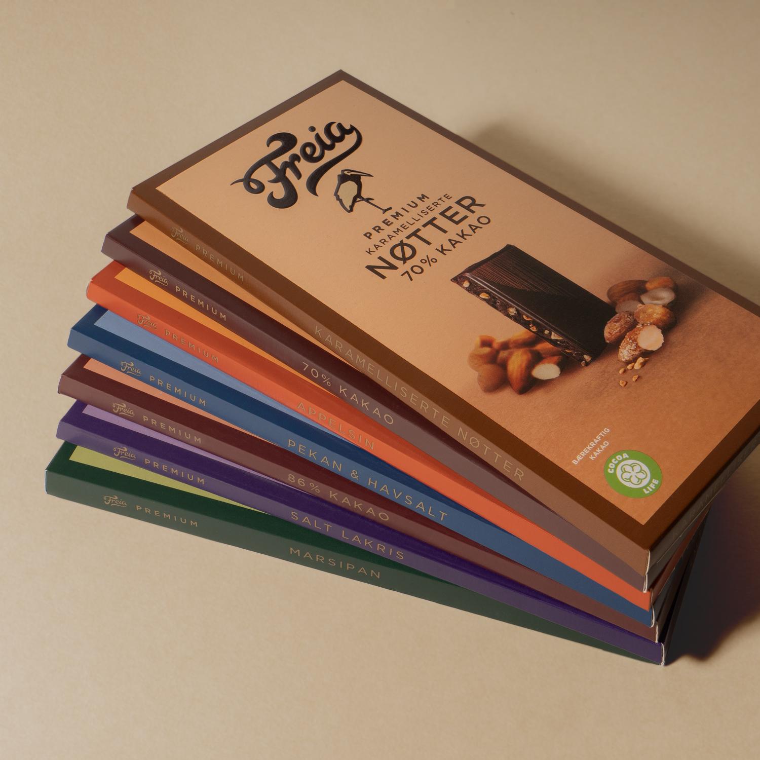
The chocolate company Freia, with its long history since 1889, has a special place in norwegian hearts. The premium series is the best chocolate Freia has to offer in its product range. In order to increase taste differentiation, and modernize the series for a larger target group, a new design was needed. Part of the new design project was to explore if we could use the marabou-stork in a more important role as in earlier days of packaging design. The stork joined the brand in 1907 as an illustration on a cacao packaging. Since then it has always been with the brand as a additional icon, but over time has become less used overall in packaging.
Get unlimited access to latest industry news, 27,000+ articles and case studies.
Have an account? Sign in


