Don’t Cry Over Spilt Milk Punch’s Packaging
By
Published
Filed under
By
Published
Filed under
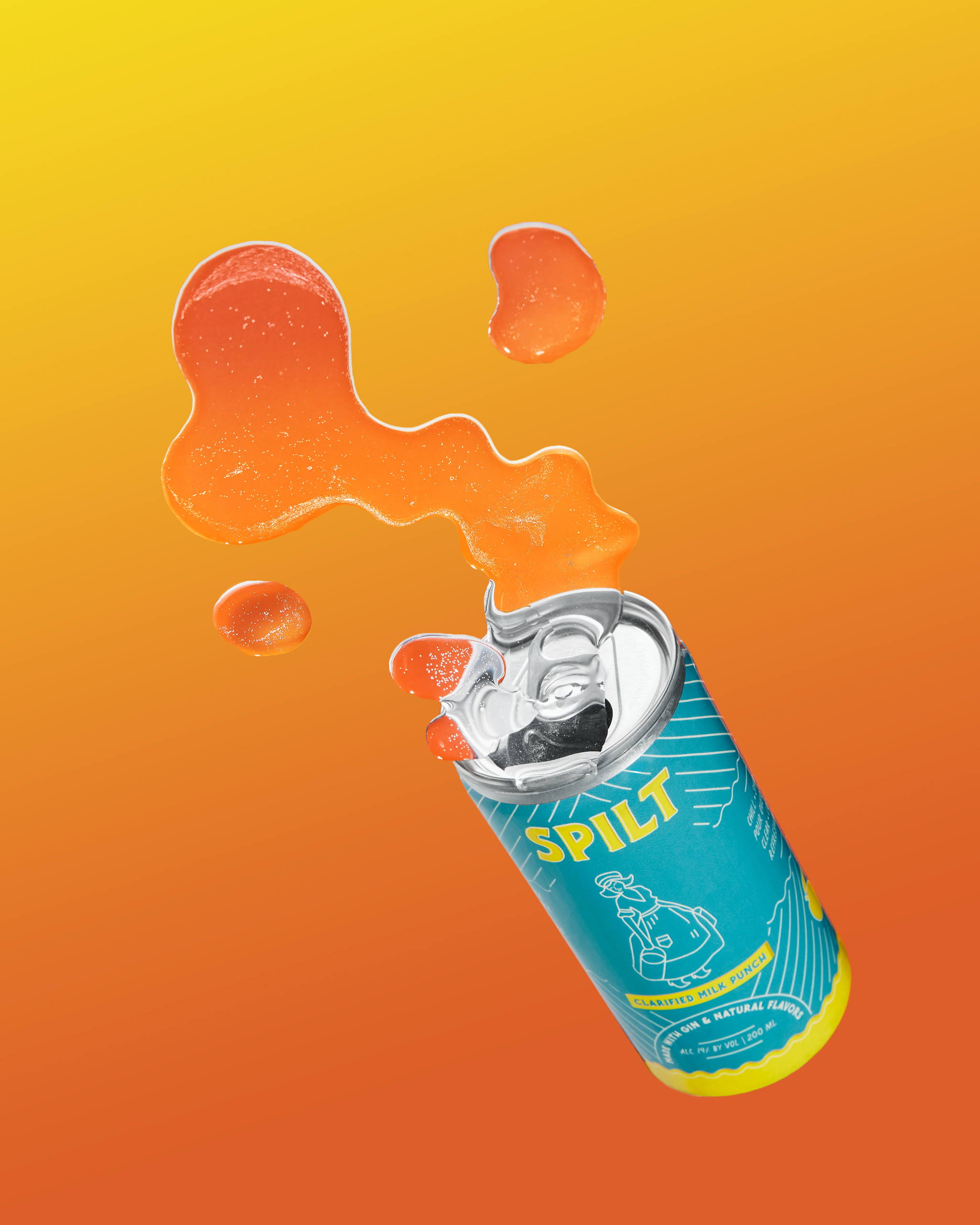
Eva Enger’s packaging design for Spilt Clarified Milk Punch showcases the rich history and quality of this cocktail. Drawing inspiration from antique milk advertisements, vintage cardboard milk caps, and classic milk bottles, the design alludes to milk while highlighting the fresh lemon and orange juice ingredients. The blue, sky-like color palette represents the cocktail’s clarity, creating a visually appealing and inviting package. This design not only conveys the authenticity of the ingredients but also pays homage to the historical significance of clarified milk punch in the world of cocktails. This thoughtfully designed packaging complements the cocktail’s sophistication, heritage, and delightful flavor, making it a standout in the ready-to-drink cocktail market.

Over 200 years ago, when Punch was the ubiquitous form of alcoholic beverages enjoyed in both Europe and the US, it was discovered that the addition of milk caused a reaction where the milk solids chemically bound the astringent and bitter flavors in the punch. The citrus portion of the punch caused the milk proteins to solidify and, when they were filtered through a cheesecloth a crystal clear and much improved cocktail resulted. The invention of clarified milk punch took the continents by storm.
Get unlimited access to latest industry news, 27,000+ articles and case studies.
Have an account? Sign in


