THIS IS IT! DIELINE Awards 2026 Late Entry Deadline Ends Feb 28


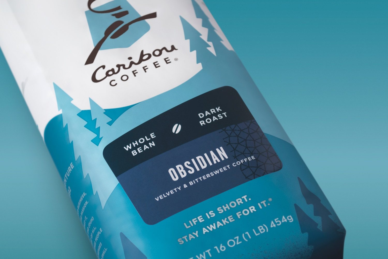
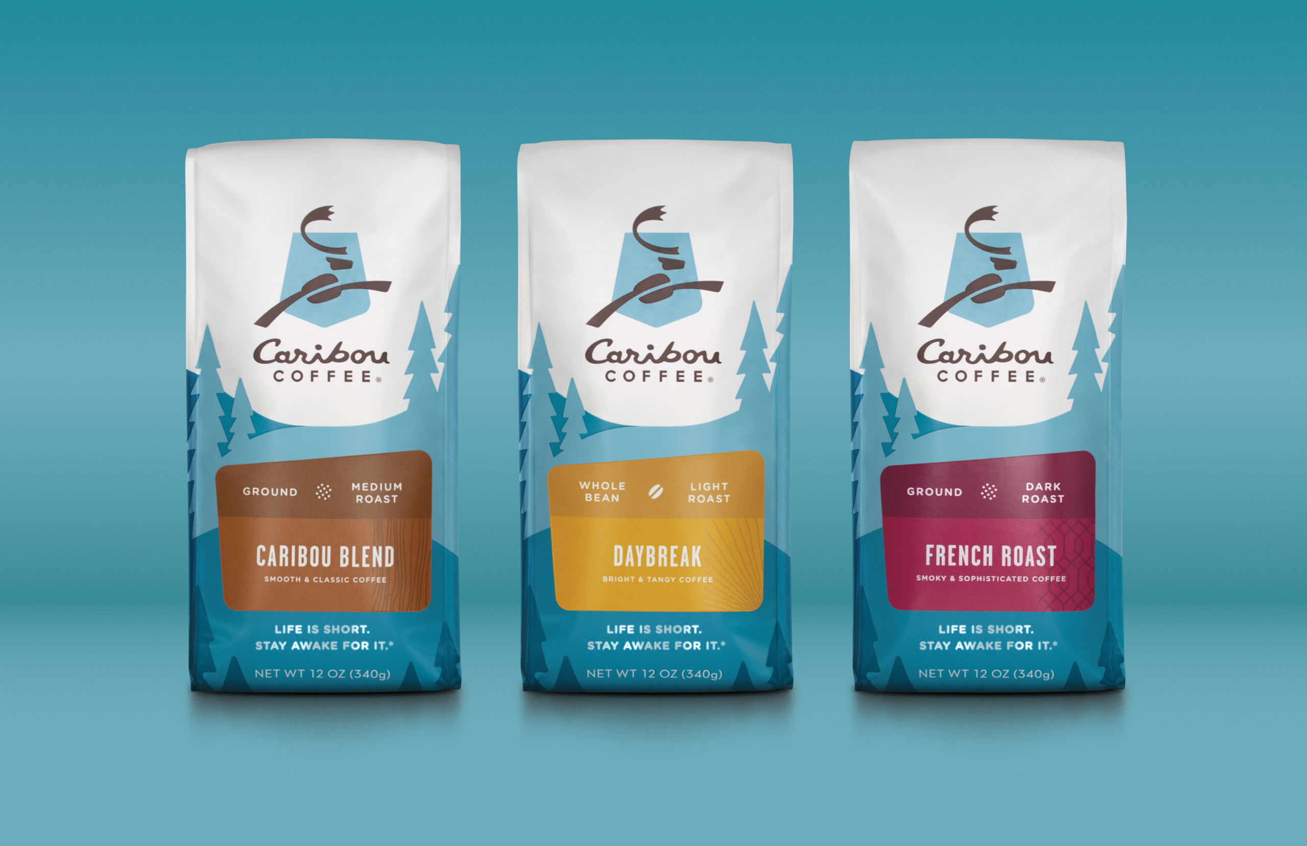
A brand with roots in the North, Caribou Coffee has been “Fueling Adventure Since 1991”, so it only made sense that the brief to redesign the brand’s signature packaging looked to its heritage for inspiration. Creating a “sense of place” not only offered a truer connection to its provenance but also created proprietary expression to unify the brand’s portfolio. An illustrative interpretation of the North leans heavily on Caribou’s distinctive blue color. The result is a strongly-branded expression that’s premium, with a playful personality.

Get unlimited access to latest industry news, 27,000+ articles and case studies.
Have an account? Sign in