THIS IS IT! DIELINE Awards 2026 Late Entry Deadline Ends Feb 28

Candela Mamajuana’s packaging by HI! ESTUDIO MULTIDISCIPLINARIO and Quaker City Mercantile is all about restraint and texture. I think sometimes rum packaging can get too caught up in the history, but this design does a great job of balancing the soul of the brand with a contemporary twist.
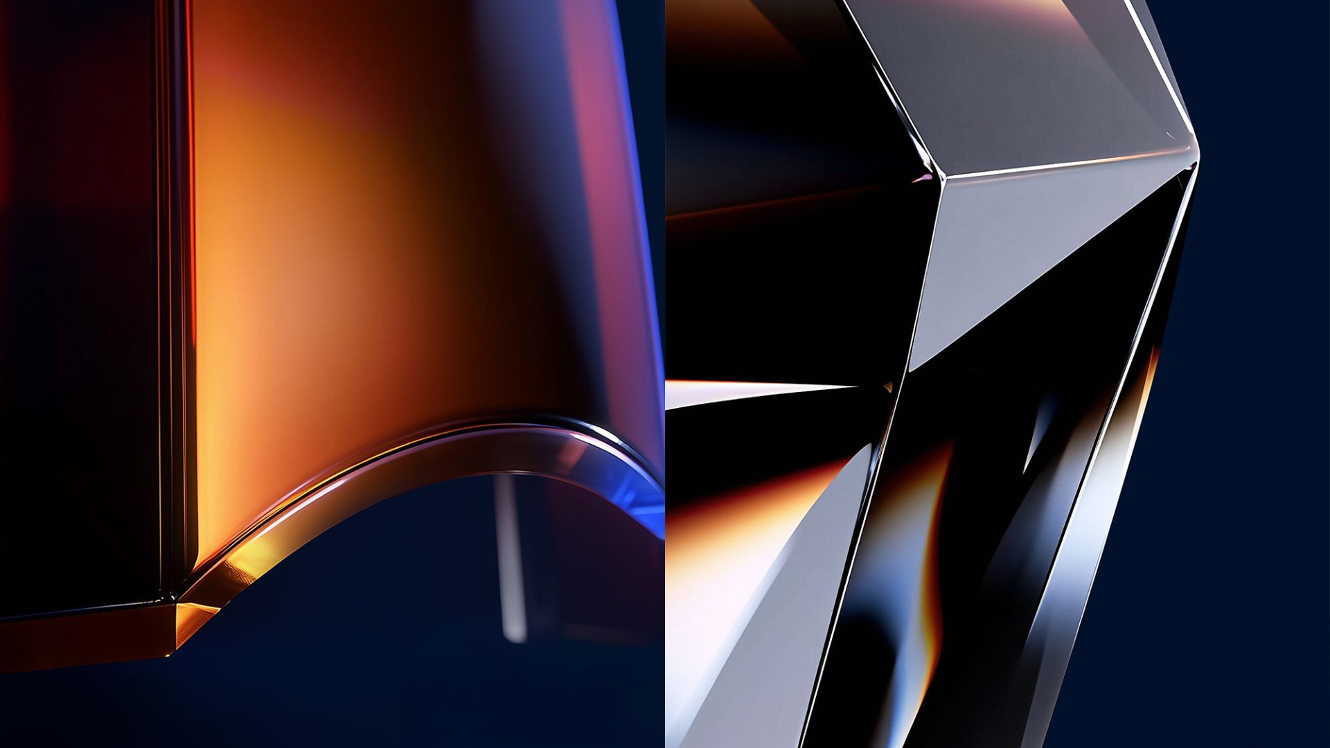
The bottle’s dark glass features embossed details that catch the light just enough to hint at its craftsmanship, while the label balances copper foil typography with clean serif lettering. The jagged edge of the label adds a tactile break against the smooth glass, grounding the design in a subtle sense of movement. A copper lion anchors the look, giving the bottle a confident energy without being pretentious.
Get unlimited access to latest industry news, 27,000+ articles and case studies.
Have an account? Sign in