Featured image for GreeThings From Croatia

GreeThings From Croatia

by Casha Doemland on 05/10/2018 | 4 Minute Read

Editorial photograph

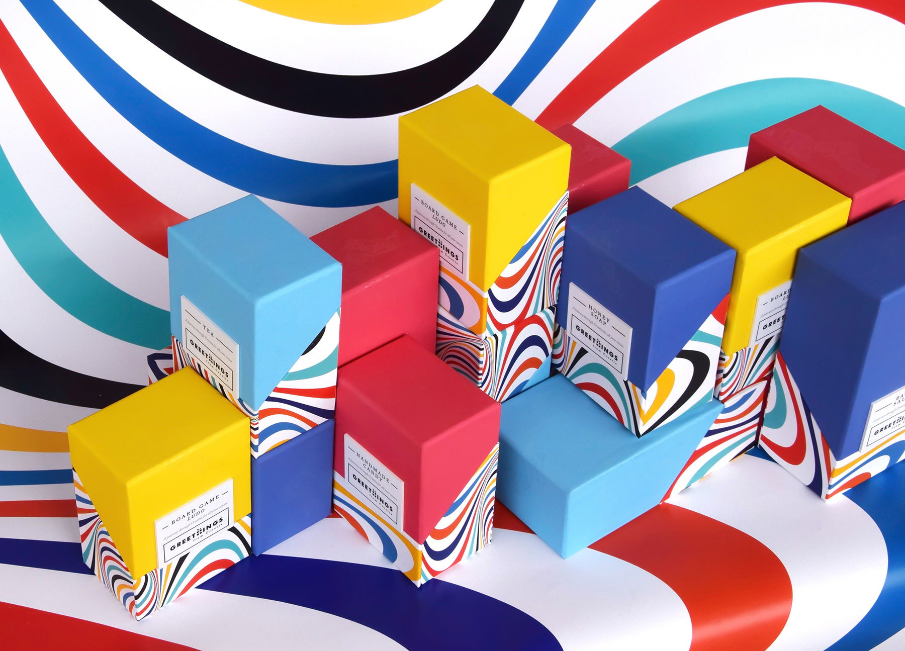
What happens when a design firm compares the culture of Croatia with experience? Bright and oh so very colorful packages for Croatia's products tea, natural honey, puzzles, aromatic wine and much more. This design by Magdalena Krpina Zdilar features a solid color on the top, equipped with a white logo and black print and 70s realness swirls on the bottom. 

"GreeThings from Croatia is new Croatian brand which collects best of domestic Croatian products which induce every sense. The series contains about 20 products such as liqueurs, spices, bath salts, hot spices, sauces, beeswax candles, honey, honey-soap, board game Ludo, hand creme,  and others. Every product is originally made in Croatia and packed in GreeThings boxes which makes them the perfect souvenir. Every box has the magnet which secures that product doesn't fall out. "

Editorial photographEditorial photographEditorial photograph

"Products are packaged into color divided groups based on their characteristics and the way they are used. By using each of them, there is (basically) a single sensation through which a person experiences this product, so we have those who are experiencing touch (hand-cream, labels, bath salt...), smell (spices, candles...), flavor (sauces, candies, wine...), vision (visually rich Croatian illustrations in coloring book, puzzles, notebook, magnet clips, coasters etc.)."

Editorial photographEditorial photographEditorial photograph

"As we speak of Croatia's full experience, this concept is based on those two words - CROATIA & EXPERIENCE: 1. The first word - CROATIA. In this case, it is conceptually and visually contrasting to the first-world experience and it is shown through the material. On the top of the one-colored soft touch coated packaging is a lightly embossed foil stamped map of Croatia with original relief that makes a unique texture so you can actually FEEL CROATIA. Croatia in the geographical, material sense can be felt in all its forms (mountains, lakes, rivers, sea, islands). A geographic map is a motif that is closely related to traveling and every tourist needs one. It is educational, provides a lot information and shows the country with all its wicker characteristics (size, position, distance, altitude and lowlands, greenery). The geographic maps serves as a part of the visual identity that supply information on the place where products are made and that gives them additional value. "

Editorial photographEditorial photograph

"2. The colorful pattern is created by trying to visualise the term EXPERIENCE. An experience arises when information goes through receptors in the brain and it is interpreted as a non-material and non-tangible experience which has something to do with emotions and memories. After traveling, trips, meetings, memories and experience are the ones that lasts longest. This idea suggests that you can enjoy Croatia in the single product you buy, but definitely invokes the full experience by buying more products (more products - better experience). 

The packaging of the product is designed to provide a complete image (experience). Each packaging (as well as product) is very attractive by itself, but with the others, it makes it whole.  By creating an emotional connection with a consumer, the product is based on the idea that GreeThings is not just a souvenir, but a product that gives you Greet (non-material, experience) and the Thing (material, product, gift) in one. 

Editorial photograph

Agency: Magdalena Krpina ZdilarDesigner: Mate ZdilarLocation: Zagreb, Croatia