DIELINE SHOP - ALL HATS 10% OFF THIS WEEK ONLY
Featured image for Deon Libra Rattles The Adaptogen Space With Its Innovative Packaging System

Deon Libra Rattles The Adaptogen Space With Its Innovative Packaging System

by Chloe Gordon on 03/07/2023 | 4 Minute Read

We're sitting at an intriguing convergence in the packaging world. We're currently in a space where people care deeply about self-care and comprehensive wellness yet are simultaneously overindulgent and crave unrestrained living—think Olipop: it looks, smells, and tastes like an indulgent soda, but its ingredients blend botanicals, plant fibers, and prebiotics chosen for their biome-supporting benefits.

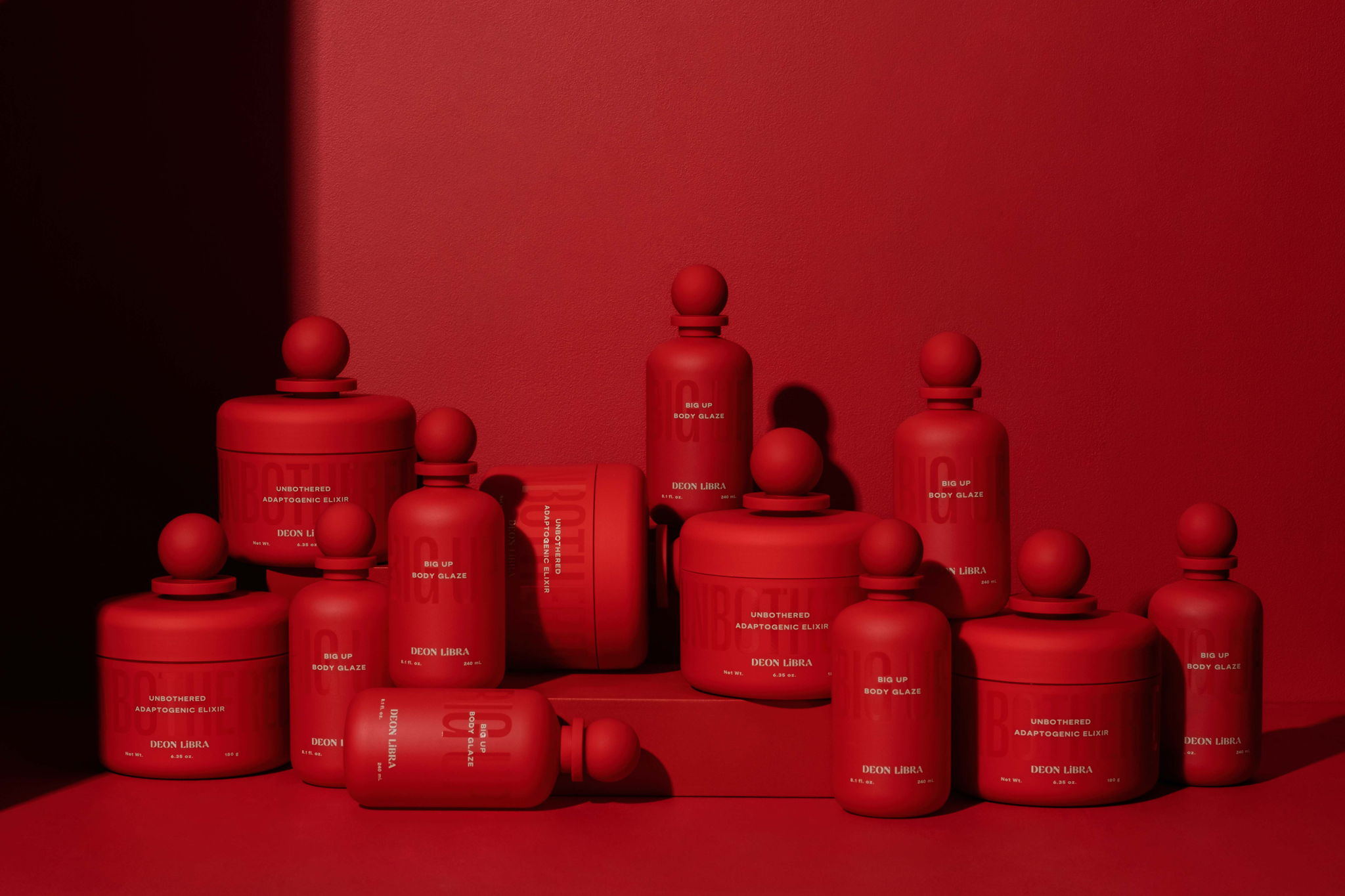
At the intersection of these two distinctly different perspectives beautifully rests Deon Libra, an adaptogenic elixir promoting functionality with an unexpected IDGAF attitude and luxurious undertones. The convergence of these attitudes, showcased from the packaging alone, is splendid and taps into the consumer's current mindset: bougie wellness—the Goop paradox. 

3k9p0EFe.jpeg

The Glossier Grantee, co-founder, and CEO Devin McGhee founded Deon Libra as a more approachable product for Black consumers, specifically within the adaptogenic beauty space. 

The brand's industrial bottle design, masterminded by Chris DiGiacomo, looked to Vintage Murano glass bottles and their innocuous bulbous tops. "The design was inspired by a mood board supplied by the brand's founder, Devin McGhee. Vintage Murano glass bottles on the board stood out as one of the stronger directions. My goal for the design was to create a simple yet bold bottle and jar silhouette," shared DiGiacomo. "To start, I created a line-up of several bottle silhouettes. No graphics, just vessel and cap shapes in black. We reviewed the silhouettes, picked our favorite, modeled the components, and created renderings."

5x2EA4hI.jpeg

The bottling system alone instantly created an attention-grabbing hook for consumers mindlessly browsing shelves by investing in a trademarked shape. The adaptogen space has yet to break free from simple jars or monotonous plastic bags, and by placing a powder in a new form, the threshold for intrigue is seamless. 

"There is so much stock packaging out there that these designs can't help themselves but stand out from the rest. It amazes me how many brands use the same components, using their branding and decoration as the only way to differentiate," expresses DiGiacomo. "Investing in proprietary component shapes is the best way to get consumers' attention. I'm surprised more brands, especially the larger ones, don't level up." 

18EWuiVn.jpeg

The adaptogen elixir's branding, graphics, and carton come courtesy of Nice People, a creative agency based in Los Angeles. The agency focused intently on the luxury aspect, leaning instantly into the aura in every facet of the design. "When we think of luxury, we think of couture or bespoke designs," stated Amber Asay, founder and creative director of Nice People. "Every corner of this brand, from the website to the packaging, is carefully thought through and brings elements of never-been-done-before experimentation. Typography selection was also a big player in what felt luxurious and sophisticated. Small point sizes and high contrast display serifs are among our luxury leaning choices." 

CUfbXug6.jpeg

Because McGhee was so focused on creating a brand that seeped its strategy into being both luxurious and disruptive, the typography within the packaging system needed to do some heavy lifting. Nice People landed on five distinct typefaces, each chosen for a precise intention. "From bold condensed sans serifs to high contrast reverse stress typefaces, we brought the most unexpected elements together and ensured they paired well," shared Asay. "We also layered in other textural moments, like type treatments in circles and waves that you'll see throughout the website. Our toolbox is full for this brand, creating endless design opportunities." 

Deon Libra is a brand that understood what Black consumers were missing in the adaptogen space—a product that felt approachable yet highly luxurious. McGhee fully understood this gap and created a packaging system that's instantly recognizable and makes an intentional, thoughtful, and assertive brand presence. As a result, not only is Deon Libra a pioneer in the adaptogen space, but the powdered packaging system and imaginative product design are innovative enough to inspire the entire beverage category. 

GKDn6gGV.jpeg
mQrBcZyD.jpeg
xrY5fOwF.jpeg