DIELINE SHOP - ALL HATS 10% OFF THIS WEEK ONLY
Featured image for Transforming Chip Packaging As We Know It With Miett’s Playfully Casual Design

Transforming Chip Packaging As We Know It With Miett’s Playfully Casual Design

by Chloe Gordon on 03/27/2023 | 3 Minute Read

Beyond opposable thumbs and a functioning brain, enjoying the excessively addicting, faultlessly salty, and impeccable crunch of a potato chip is one of the many joys of being a human. Yet, while relishing the satisfaction of consuming a bag of thinly crisped potatoes is delightful, choosing which bag to gobble up from a shelf full of hundreds of options can be frustrating, especially when they all have a similar, overly corporate aesthetic. 

Editorial photograph

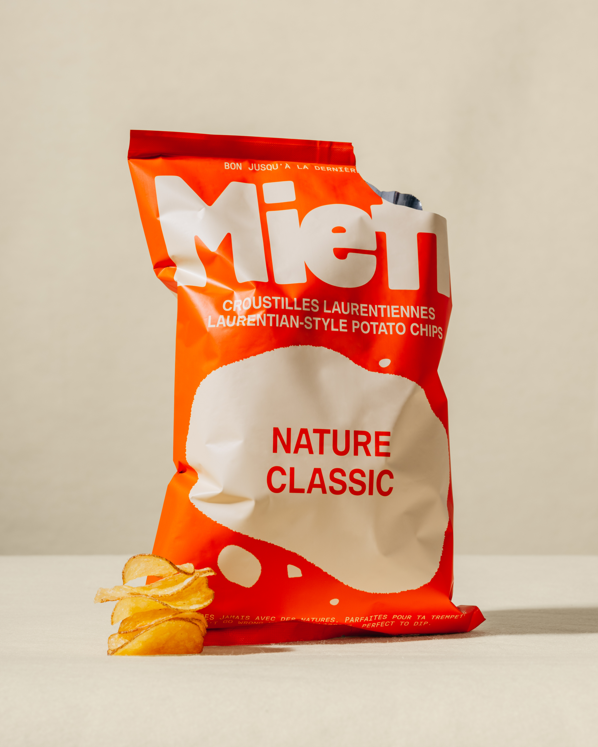
Enter Miett, a new savory snack based in Québec, with a packaging system that transforms chip packaging as we know it. 

The oversized logo at the top of the bag adds a quirky yet bold statement, highlighting an almost cartoon-inspired take and infusing the brand with a delightfully offbeat attitude. Moving down the bag, the chips are described in an all-caps sans serif typeface, adding a minimal balance to the oversized logo above. Finally, the bottom half of the bag is overwhelmed with an oversized geometrical shape that mimics a potato chip with the flavor description placed within. 

Editorial photograph

Designed by Deux Huit Huit, the packaging design takes inspiration from the brand's farming approach fused with an upscale happy hour-inspired aesthetic. The nostalgic design is minimalistic, but the brilliant colors add a contemporary touch. Instead of borrowing from the usual chip tropes or their competitors' stale packaging, the brand's authenticity shines through with its playful and casual design system. 

Editorial photograph

Because Miett's chip bag diverges from the traditional, it leaves a lasting impression and creates shelf impact for consumers. The nostalgic, cartoon-inspired take creates a playful aesthetic, but the rich design elements add a clever sense of indulgence that most savory snacks miss. The design is simple, but the elements coalesce to create an ever-striking packaging system. 

The color palettes used across the packaging take inspiration from the flavors of the chip. For example, the Maple BBQ flavor gets tucked inside a dark maple brown bag with sweet, tangy purple accents. Likewise, the Salt & Sumac flavor takes a beachy tone with a bright blue bag and a creamy green hue representing the subtle zest from the sumac. 

Next time you're in the overwhelming chip aisle, take in the corporate jargon and commercial designs from Lays and company—you'll have a whole new level of appreciation for Miett's packaging. 

Editorial photograph

Editorial photograph