THIS IS IT! DIELINE Awards 2026 Late Entry Deadline Ends Feb 28
Rascals Brewing Company’s Packaging Design Is Bursting With Color And Imagination
By
Published
Filed under
By
Published
Filed under
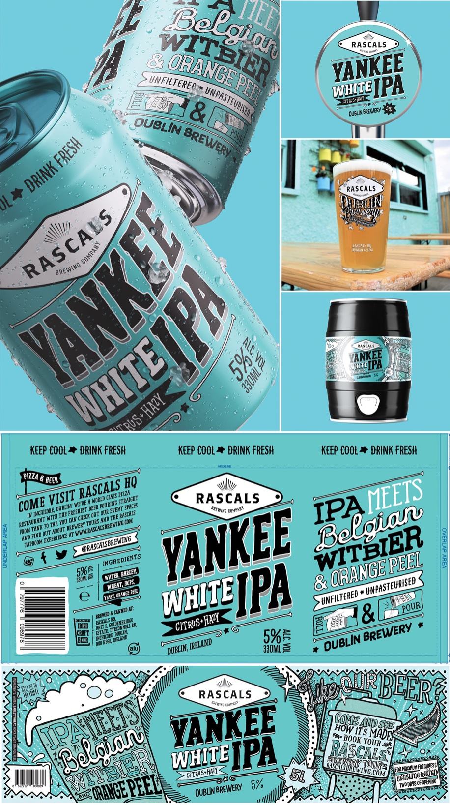
Penny Whip Studio put typography at the core of Rascal Brewing’s packaging design. While the bright colors and hand-drawn illustrations create a homegrown aesthetic, the stunning typography makes all the difference in this design. It’s playful, accessible, and makes the beer space more inclusive.
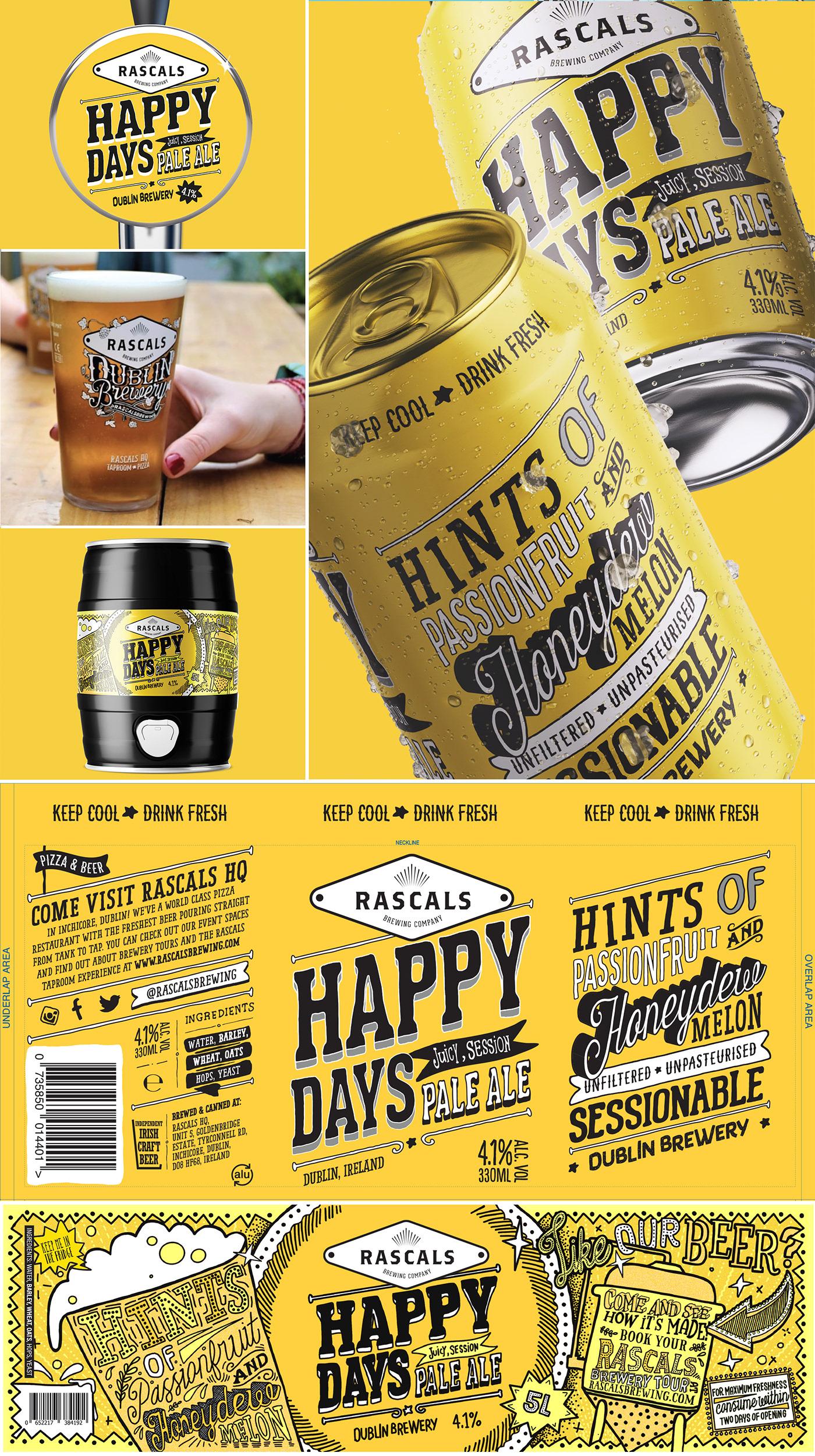
The visual style is fun, bright, eye-catching and bursting with colour and imagination. To add to our customer’s experience of the beer, each can has a fun name and we include an illustrative beer education on the back. We think of the core range as your ‘home base’, so the graphics are simple hand-rendered typography with beer names that give a little education on the style and taste. Each core beer has a striking colour to convey their uniqueness and stand apart from each other, while still ensuring the brand identity is communicated collectively. To contrast this, the specials are designed to inspire people to be a little bit adventurous. Typography is still front and centre, but we use bright illustrations and patterns to back up the typography and often add an offbeat twist.
Get unlimited access to latest industry news, 27,000+ articles and case studies.
Have an account? Sign in