Eath’s Best, Baby Wipes Use Characters On Its Packaging To Represent The Products Within
By
Published
Filed under
By
Published
Filed under
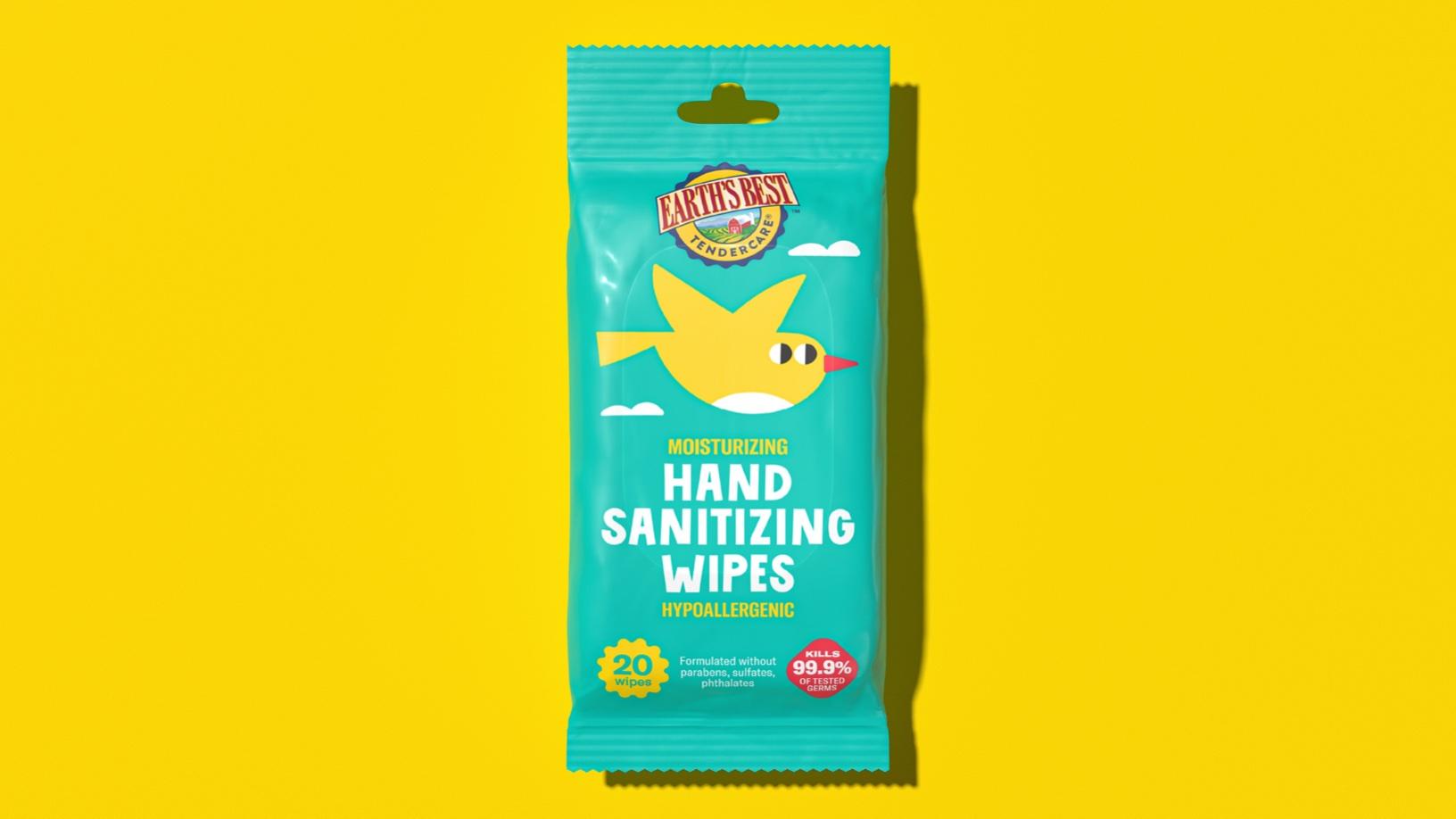
Earth’s Best packaging, designed by Caparo, implements quirky animal illustrations into the design representative of the product within. For example, on the Bamboo-fiber wipes, there’s an adorable hanging from bamboo. Each product tells a story, and the characters and colors effortlessly work together to make an approachable and playful packaging system. Baby wipes have never been more delightful.

Erath’s Best is one of the top organic baby food brands in the US with a portfolio expanding in body care and hygiene products. The look & feel of the packaging lines of the brand has some vintage and iconic elements (such as the widely recognizable Earth’s Best logotype).
Get unlimited access to latest industry news, 27,000+ articles and case studies.
Have an account? Sign in


