THIS IS IT! DIELINE Awards 2026 Late Entry Deadline Ends Feb 28
Ming Yuan Honey Visualizes The Industrial Nature Of Bees
By
Published
Filed under

By
Published
Filed under
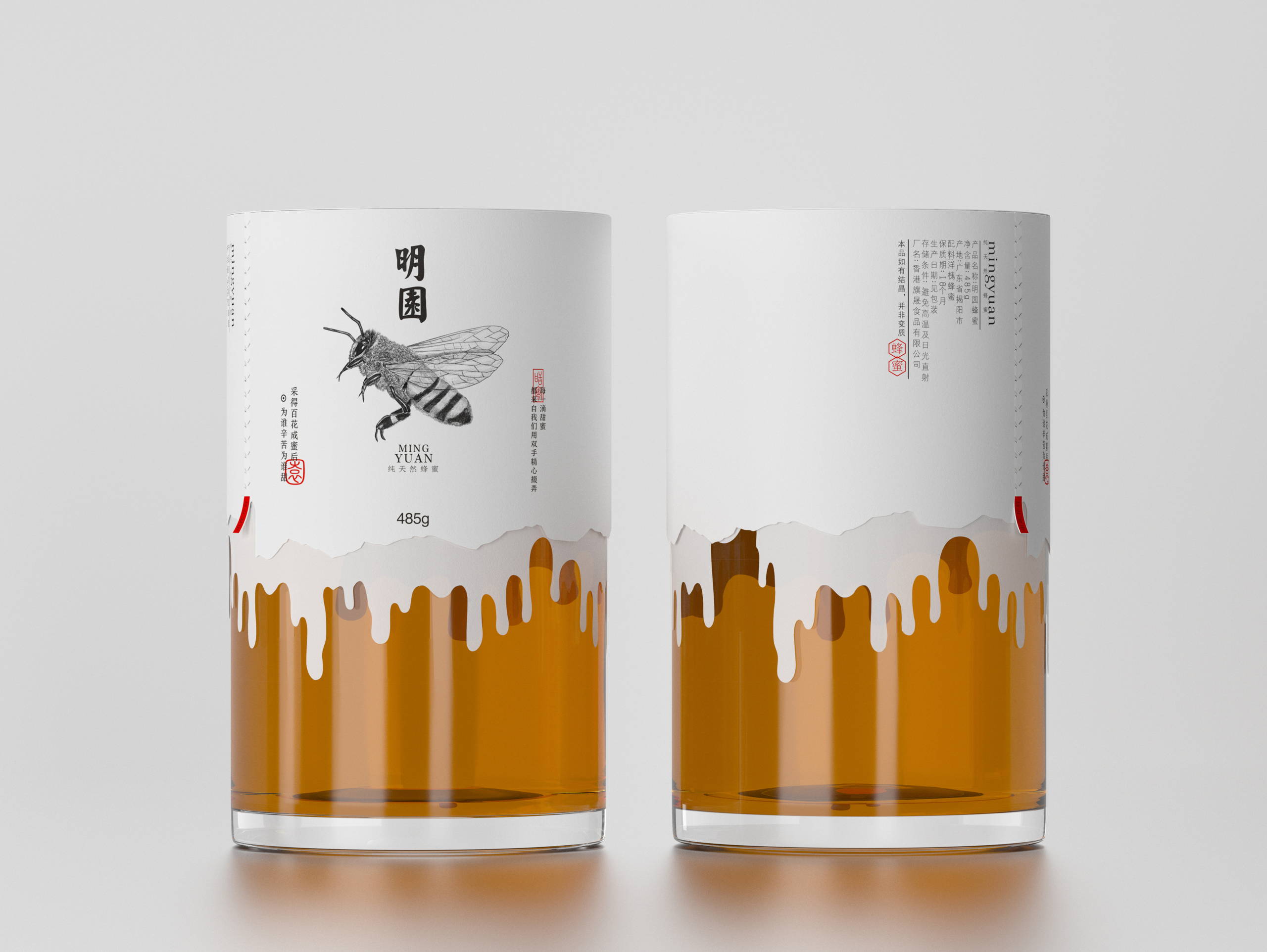
The design of the Ming Yuan Honey packaging is intended to visualise the industrious nature of bees in an intuitive and realistic way. Therefore, the glass jar displays honey that appears to flow lusciously over the rim in its classic golden brown colour, thus acting as a visual sensory stimulus to metaphorically transfer the wonderful taste of honey from the taste buds directly to the consumer. Wrapped around the top half of the jar is a pure white, thin paper, perforated at one point so that it can be easily torn open by pulling it upwards.
Underneath, the actual lid is revealed, and hidden on the jar itself is a group of small bees, busy as ever trying to find the honey source – which appears both as a large sunflower and thus pollen and nectar, the bees’ food source, and as a honeycomb in a hive where the busy insects store the healthy nutrient they have diligently collected. These different layers are meant to surprise the consumer when they open the special paper for the first time, as the jar underneath authentically reflects the natural quality of the honey.
Get unlimited access to latest industry news, 27,000+ articles and case studies.
Have an account? Sign in


