22 Standouts from Expo West 2022
by Fred Hart on 03/15/2022 | 8 Minute Read
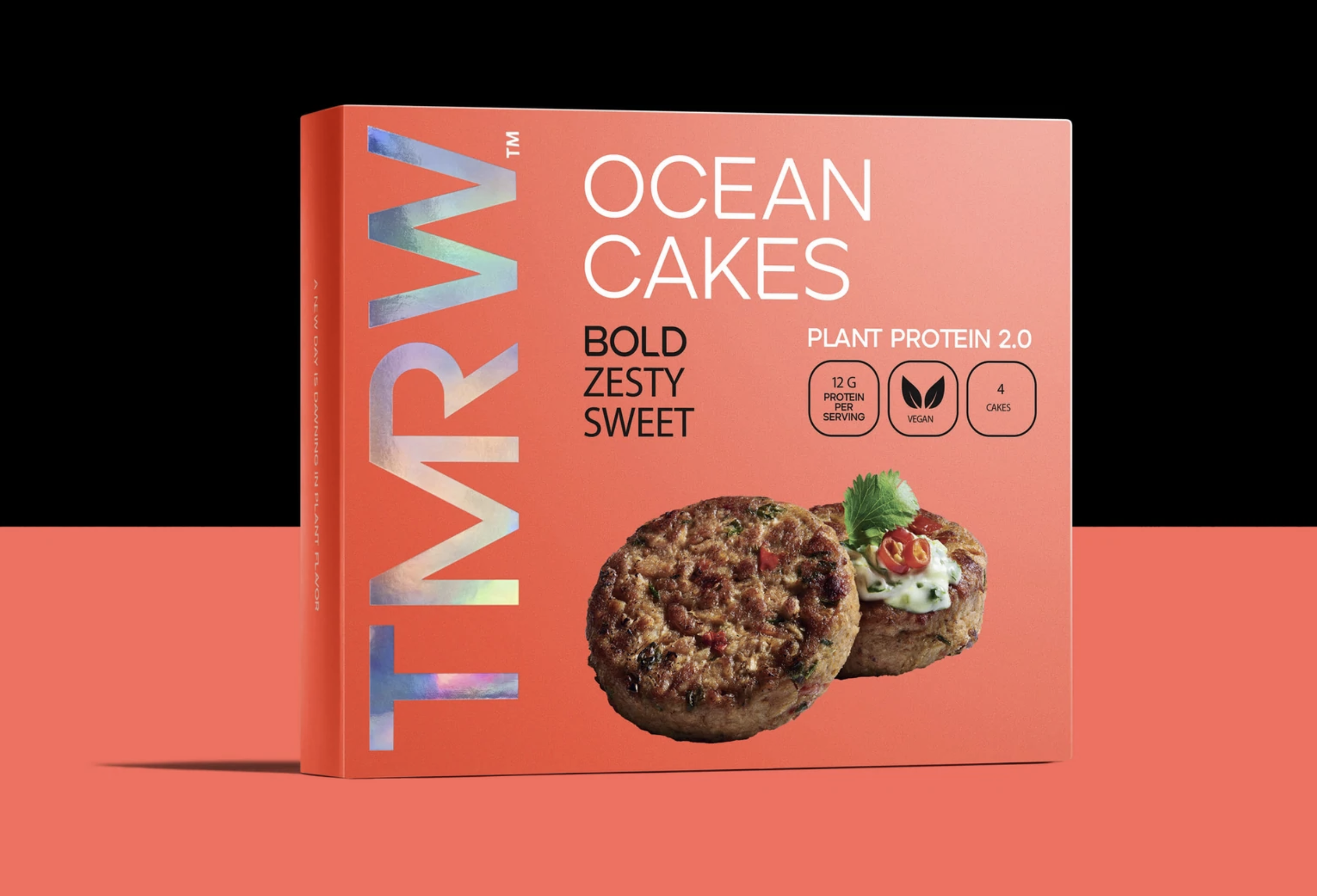
It’s been two years since we walked the floor at Expo West, and as a result, there was a pent-up explosion of rebrands and new brands flooding the halls and tradeshow floors. What’s more, we got a firsthand look at the trends that are shaping the world of food and beverage, with plant-based alternatives galore, new-to-world snacks, and refreshing updates to well-worn categories like diet cola.
So in 2022, we celebrate the brands that persevered and the entrepreneurs that jump-started their dreams in the face of the pandemic with 22 standout brands with showroom-worthy packaging design.
There’s a tidal wave of meat alternatives hitting the market, and it's not just plant-based burgers vying for domination; now, we're starting to see viable chicken alternatives and even seafood. One way to stand out, of course, is with disruptive design. TMRW Foods' abbreviated name hints at the tech-like packaging that breaks all of the rules at the shelf, with a bright, orange box with a holo-foil wordmark, stark photography, and a unique product like Ocean Cakes (crab cakes without the crab). The future is bright (orange)!
Originally intended to debut its new look at the then-canceled 2020 Expo West, 8th Wonder finally got to show off its redesign to much fanfare. The brand traded in its old-world look for a new graphic visual language that provokes a sense of awe and wonder, one that's all the more heightened after tasting their functional sparkling teas.
Unbun wants to revolutionize bread as we know it and have ventured into the world with a brand new look and feel. Stark, graphic, and filled with lots and lots of blue, you could say this is a blue-sky approach to branding in the carb category. Check out their website to see a fun ticker-tape aesthetic, as UNBUN creates an infinite cycle of itself: UNBUNBUNBUNBUNBUNBUN.
Great names should always beget great design. FatSo, the flavored peanut butter brand loaded with plant-based super fats, just rebranded, finally aligning those two things with a healthy dose of personality to go alongside it. Irreverent and expressive food photography, chunky type, and fun colors have us rejoicing over healthy fats.
Welcome to the future of farms, where we harvest plants to make meat! Forgoing color, Future Farm utilizes a stark black and white world to disrupt at the shelf, accented by a friendly little future-forward smiley face. Quirky, crazy, and full of attitude, the brand world feels all the more energetic now that we’ve stopped eating the animals.
Move over Faberge Eggs, there’s a new luxury egg in town, and it's edible! Consider Pastures raises the bar immensely with its premium, elegant branding. The packaging structure (created by the founder) gets made entirely using paperboard. The design elements feature gold foil, a beautiful color palette of soft royal blue and cream, and a lovely pattern along the front face of the pack. The most incredible part—each purchase supports regenerative agriculture.
Premium chocolate has always had a drab reputation, trying so hard to look and feel premium that it ends up cheapening it to the discerning. TCHO’s redesign teaches us that it doesn’t have to come at the cost of originality. Great copywriting, a simple color palette, and playful typography create an elegant and engaging design language that surely tastes as good as it looks.
New age energy drinks were a prominent trend at the show, but one of our favorites relied on ancient secrets. Machu Picchu anchors its design system around Peru's Huayna Picchu mountain peak. Blocky letters and serifed copy provide a mix of strength, antiquity, and nature all in one.
Ooey Gooey. Those two words certainly lived prominently in the creative brief that spawned this delicious nutrient-packed take on the classic mac-and-cheese. Expressive type, lively colors, a fun name, and indulgent photography creates a veritable invitation to flavor town. Cue Guy Fieri.
Milk brand Zeal has found its zest. With a refreshing soft green as its new brand color and an illustration that feels handmade and as quaint as a small-town farm, the new look inspires trust while looking deliciously grass-fed.
The dawning of a new age in soda is upon us. Uchie was a show floor stopper, breaking every category convention from a design perspective. The whole idea is to redefine the visual language of diet soda, and it's a feast for the eyeballs. Framed soothing gradients and shapes hint at the possibilities contained within. This definitely ain't your grandpappy's Diet Coke.
Ozery Bakery launched a new line of snacks at the show under the new brand banner of Seedwise. The design delivers on the name, putting the seeds and other flavors boldly at the forefront with gorgeous, life-like illustration. Just because it's grain-free doesn't mean it's lacking in punch.
Holy Moly! Wholly Veggie unveiled a new look at the show, forgoing its old and stale look and feel for a wordmark-first approach packed with personality and flair. The repeating logo motif piles on the charm and acts as a divider for bilingual information, with English at the top and French at the bottom. The plant-based veggie snack brand could be the next late-night treat after your next bar crawl.
Cure's functional drink mixes went through a brand overhaul, moving into a crisp, clean, and editorial-inspired design and layout. The system hinges on a masthead-like logo with beautiful photography underpinning the packaging. If the supplemental results are anything like the new look, we’re in.
Can a chicken change the world? Pasture Bird thinks so. And the more chickens it sells, the more significant impact it can have on the world with its pasture-raised birds and regenerative farming ethos. So naturally, the design can’t lay an egg. Lucky for us, the homespun and down-to-earth illustration style, paired with a stately, serifed wordmark and unique packaging structure, create a grounded and premium aesthetic.
Nothing hits in the fall quite like a piping hot mug of chai. Seriously, forget all that pumpkin spice nonsense. This newcomer in the space by its awesome BIPOC founders has also resulted in some equally awesome design—bold wordmark, beautiful brand blocking, and a touch of script to lighten it all up makes for a critical impact on the shelf.
BellyBrain is a new startup out of LA working to reimagine gut and brain health with a fun line of squeeze-pack smoothies. The typography on display embodies the soft, rounded nature of our insides (fun flex alert) and pairs well with the probiotic-inspired characters.
If Steve Jobs were in attendance at the show, he would’ve been proud of this brand—extremely clean, simple, and modern. The Better Bagel eschews a less-is-more mentality, which frankly lends credence to its $45-for-a-12pk price point. That said, it’s a category disruptor from a product and design perspective.
Jewel tone packaging. Thick, simple serif. Grilled “chicken” pieces with hard shadows. A supportive serif typeface with a touch of charm. These are the simple pieces that make the Daring packaging, well, daring. Watch out for this plant-based chicken brand as it clucks things up.
The future of mushrooms cultivation is here. The naming serves as an ode to a humble plot of land, alluding to a small footprint from their vertical farming technique. The no-frill packaging still manages to stand out and give your farmer's market a distinctive carton.
They say it’s good to go against the grain, so current foods swam against the current to create a mind-blowing plant-based fish alternative. And to help sell this fish-like phenomenon, they’ve opted for a colorful and vibrant approach. The wordmark gets embedded with winks and nods to the marine world, while the pack has a wave-patterned deep blue brand color along with touches of typographic quark reminiscent of what we're seeing amongst the Gen-Z aesthetic for a next-generation seafood.
At first blush, De La Calle’s packaging almost feels too simple. But examining the brand in its entirety reveals a rich, colorful and nuanced world. The booth at the show was filled with textures and depth, and the website unleashes a typographic suite that complements the paired back cans. Plus, the brand photography brings an authentic backdrop filled with delicious environments. Now, this is a design street we’d like to stroll down.