Faithful To Nature is Inspired By Colors and Shapes

Published

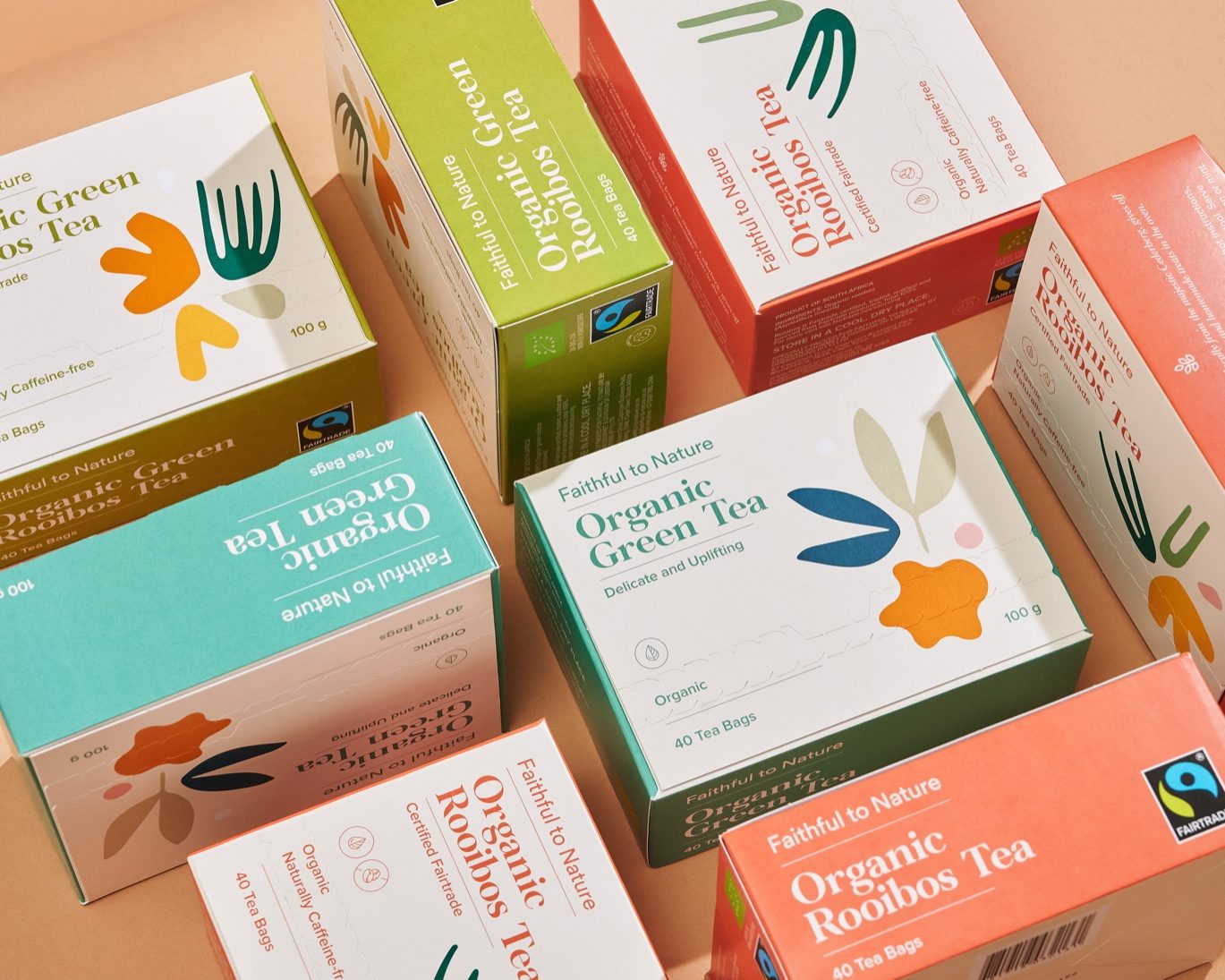
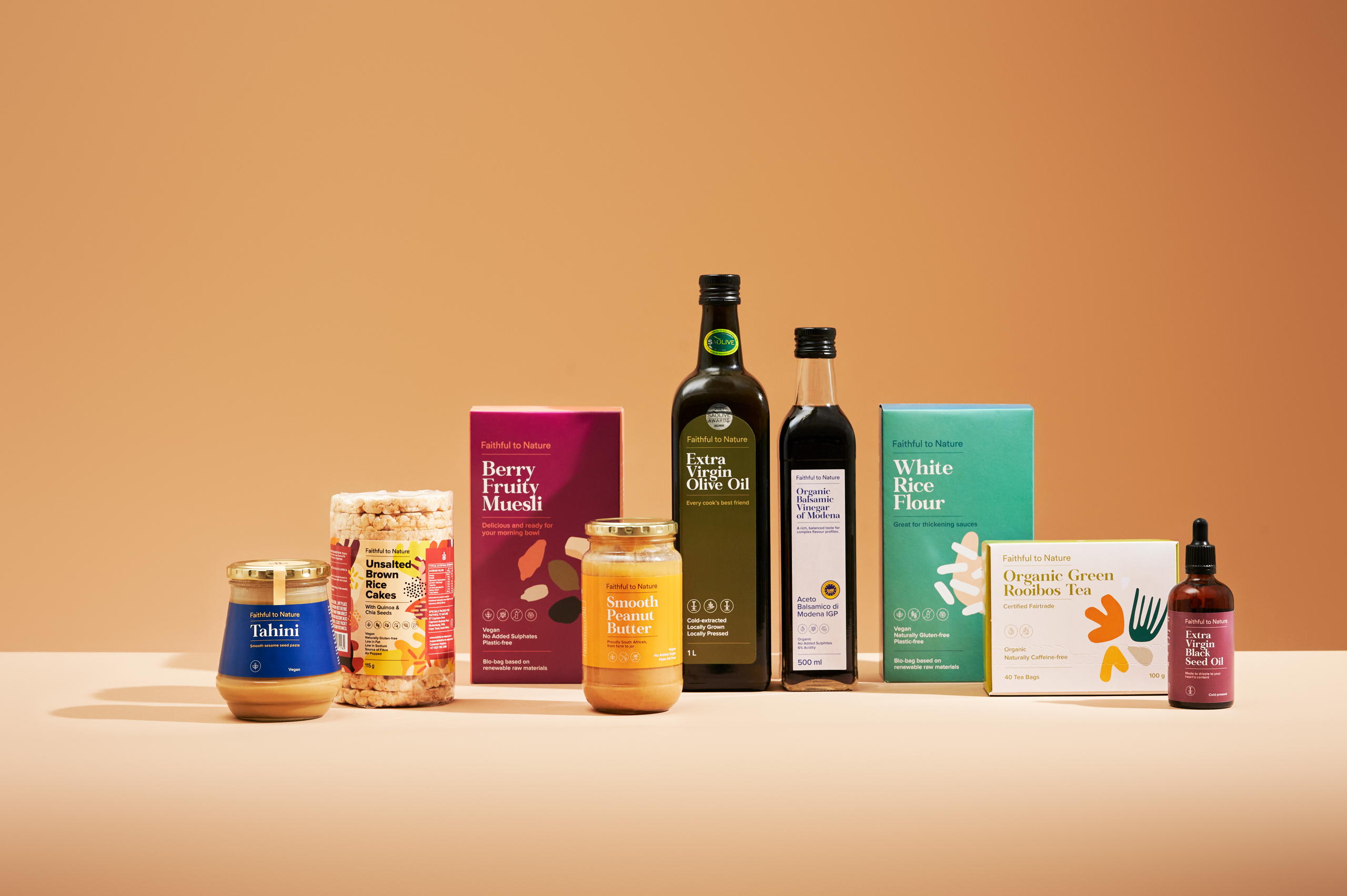
“Founded in 2006, Faithful to Nature (www.faithful-to-nature.co.za) was born with a vision to give South Africans more access to products that are better for them and the planet – to give them the power to know more and choose better. Since then, the Faithful to Nature brand has evolved beyond just supplying better options, but making them too: with a range that has evolved to include +200 food, body, beauty, home and lifestyle products.

With the development of so many exciting new sustainable products, Faithful to Nature needed a look that would be future-proof, recognizable, and align with their new, modern rebrand. Known for stocking +11 000 products from other trusted eco-friendly brands, the Faithful to Nature range needed to stand out in a heavily saturated market and become an authority on its own shelves.

Editorial photograph

So, working from the Australian shores to the West Coast of South Africa, Jo Cutri Studio and the Faithful to Nature in-house creative team conceptualized, created, and brought life to a striking packaging strategy through a virtual, pandemic world. The teams were inspired by organic shapes in nature, and – in line with the company’s value pillars – the euphoric and contagious feeling of doing good for yourself, the community and the environment. The packaging had a bigger purpose: to invite customers from all walks of life to explore better options – so, it had to look authentic, feel trustworthy, and be approachable.

Editorial photograph

The result? A celebration of shades and shapes from the natural world – a range that’s instantly recognisable with a distinguished typeset and a rainbow of functional colours that helps shoppers to browse through different ranges. The food range is bright and bold: painted with abstract, modern illustrations of ingredients for easy navigation. The body and beauty range is a combination of bright and toned-down pastels with minimalist illustrations, for the perfect self-care feeling. Finally, for peace in the home, the lifestyle range shows off Faithful to Nature’s signature green and white tones with illustrations that invite you to interact with the box to see the whole picture.

Editorial photograph

Ultimately, every piece of packaging created for the Faithful to Nature range was made to breathe life and positivity into the homes of conscious shoppers: with pleasing aesthetics and messages to reinforce the personal reward of choosing to buy products that don’t harm them, their communities, or their world.”

This placeholder is removed when the ad slot is configured.

This placeholder is removed when the ad slot is configured.

This placeholder is removed when the ad slot is configured.

This placeholder is removed when the ad slot is configured.

This placeholder is removed when the ad slot is configured.

This placeholder is removed when the ad slot is configured.